%20ammap.com%20%7C%20SVG%20map%20of%20Comoros%20-%20High%20--%3E%0A%3Csvg%20xmlns%3D%22http%3A%2F%2Fwww.w3.org%2F2000%2Fsvg%22%20xmlns%3Aamcharts%3D%22http%3A%2F%2Famcharts.com%2Fammap%22%20xmlns%3Axlink%3D%22http%3A%2F%2Fwww.w3.org%2F1999%2Fxlink%22%20version%3D%221.1%22%20viewBox%3D%220%200%20820%201250%22%20width%3D%22100%25%22%20height%3D%22100%25%22%20preserveAspectRatio%3D%22xMidYMid%20slice%22%3E%0A%09%3Cdefs%3E%0A%09%09%0A%0A%09%09%3Camcharts%3Aammap%20projection%3D%22mercator%22%20leftLongitude%3D%2243.2194%22%20topLatitude%3D%22-11.3646%22%20rightLongitude%3D%2244.5417%22%20bottomLatitude%3D%22-12.4138%22%3E%3C%2Famcharts%3Aammap%3E%0A%0A%09%09%3C!--%20All%20areas%20are%20listed%20in%20the%20line%20below.%20You%20can%20use%20this%20list%20in%20your%20script.%20--%3E%0A%09%09%3C!--%7Bid%3A%22KM-AN%22%7D%2C%7Bid%3A%22KM-GC%22%7D%2C%7Bid%3A%22KM-MO%22%7D--%3E%0A%0A%09%3C%2Fdefs%3E%0A%09%3Cg%3E%0A%09%09%3Cpath%20fill%3D%22white%22%20stroke%3D%22none%22%20id%3D%22KM-AN%22%20title%3D%22Anjouan%22%20%20d%3D%22M788.7%2C632.1L795.66%2C627.45L799.02%2C616.22L799.37%2C540.49L797.74%2C531.79L772.1%2C449.02L770.03%2C447.1L765.23%2C438.47L761.73%2C435.89L757.53%2C435.74L754.61%2C437.25L751.99%2C439.22L748.98%2C440.54L742.46%2C442.35L734.11%2C447.25L728.18%2C449.02L730.31%2C469.99L721.07%2C493.08L704.97%2C507.89L686.74%2C504.1L683.63%2C506.83L677.55%2C510.01L674.34%2C512.59L667.18%2C509.71L647.56%2C506.83L636.99%2C504.1L621.38%2C497.33L613.28%2C495.3L603.5%2C495.61L611.7%2C504.55L636.05%2C519.11L641.14%2C523.2L678.88%2C542.61L702.89%2C547.61L712.08%2C552.21L715.78%2C561.72L720.77%2C569.76L765.53%2C600.7L768.84%2C605.1L770.03%2C612.84L772.1%2C618.25L777.14%2C624.62L783.36%2C629.88L788.7%2C632.1z%22%2F%3E%0A%09%09%3Cpath%20fill%3D%22white%22%20stroke%3D%22none%22%20id%3D%22KM-GC%22%20title%3D%22Grande%20Comore%22%20%20d%3D%22M87.13%2C0L72.01%2C2.32L46.23%2C11.09L39.06%2C11.34L32.74%2C23.18L26.96%2C38.4L21.03%2C49.13L24.34%2C55.79L25.63%2C63.04L17.23%2C172.56L17.82%2C179.82L19.55%2C186.48L19.4%2C193.09L6.26%2C212.26L2.31%2C219.77L0.63%2C225.83L3.4%2C241.01L10.07%2C250.95L25.53%2C266.09L28.3%2C272.15L29.09%2C277.55L30.77%2C283.05L35.71%2C289.36L47.41%2C298.75L54.38%2C302.58L60.75%2C304.2L86.78%2C305.71L95.77%2C309.45L129.76%2C341.05L133.66%2C348.82L136.87%2C353.47L144.09%2C354.28L152.34%2C353.06L158.12%2C351.2L162.56%2C348.02L164.14%2C344.53L164.83%2C340.04L166.81%2C333.78L173.68%2C322.72L173.97%2C317.52L159.75%2C298.54L155.94%2C291.53L154.41%2C285.32L152.78%2C279.06L149.08%2C274.57L145.08%2C270.63L142.31%2C266.09L141.67%2C259.79L142.61%2C246.67L142.31%2C240.31L132.53%2C214.93L105.56%2C176.14L100.12%2C151.02L113.66%2C35.37L110.89%2C24.09L105.51%2C14.11L98.24%2C4.53L87.13%2C0z%22%2F%3E%0A%09%09%3Cpath%20fill%3D%22white%22%20stroke%3D%22none%22%20id%3D%22KM-MO%22%20title%3D%22Moheli%22%20%20d%3D%22M349.98%2C587.2L344.25%2C580.73L312.64%2C559.6L301.18%2C556.06L275.69%2C551.2L267.04%2C546.55L257.11%2C543.02L253.56%2C552.21L254.25%2C574.61L256.03%2C582.85L260.37%2C586.19L265.91%2C588.56L271.19%2C593.57L272.92%2C599.44L272.33%2C610.16L275%2C614.81L284.83%2C618.3L327.36%2C619.46L368.56%2C627.86L382.88%2C627.86L392.12%2C626.54L394.2%2C621.59L387.23%2C610.86L355.02%2C589.42L349.98%2C587.2z%22%2F%3E%0A%09%3C%2Fg%3E%0A%3C%2Fsvg%3E%0A)
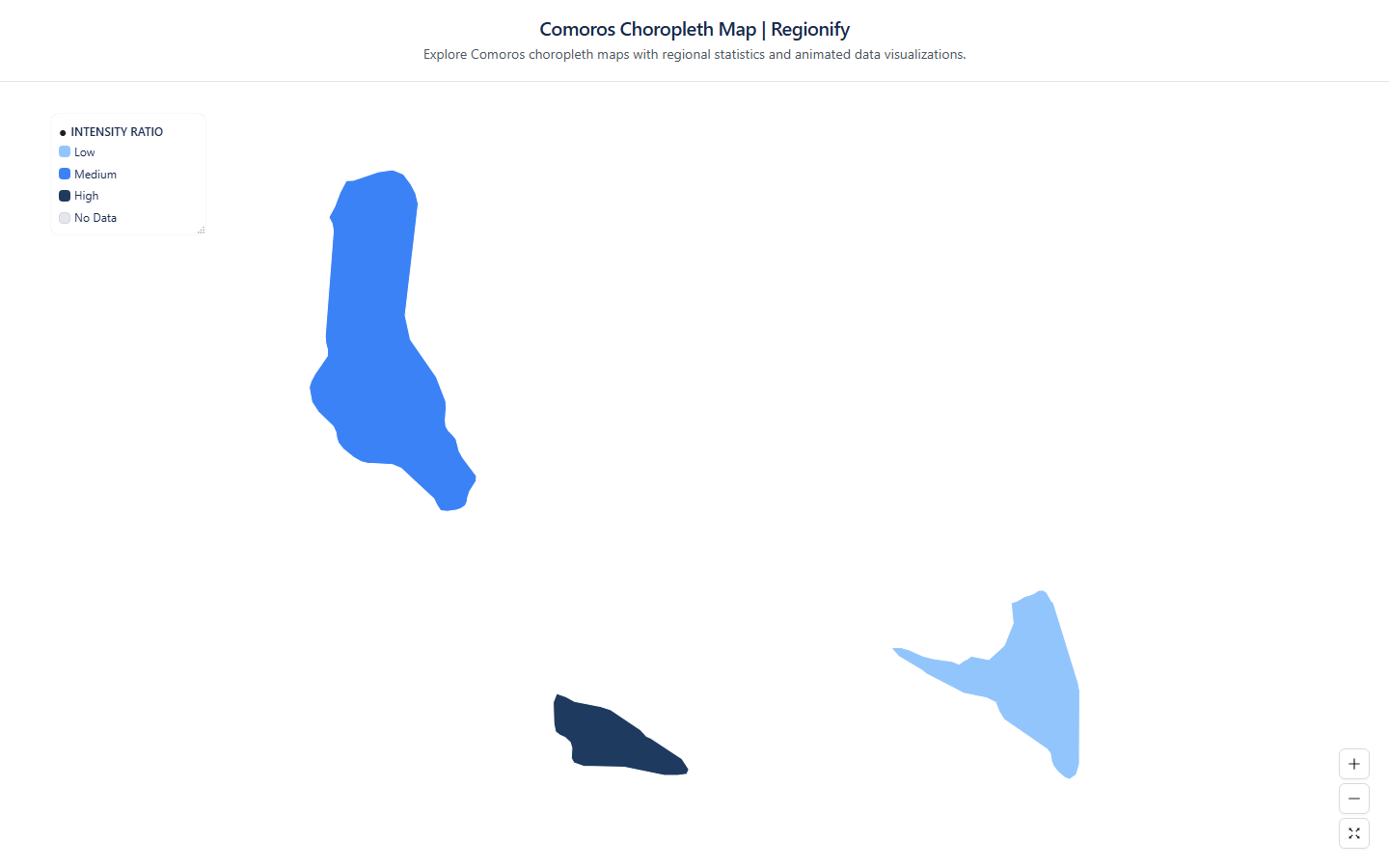
Choropleth Map of Comoros (Comores)
Regionify is a choropleth map tool that turns regional data into clear, publish-ready visualizations. Color administrative divisions by any numeric metric — GDP per capita, population density, election results, or your own dataset — then export as PNG, SVG, animated GIF, or an embeddable iframe. No GIS expertise required.
Create your map of ComorosWhat you can create for Comoros with Regionify
From static maps to animated time-series — every format, ready to export.
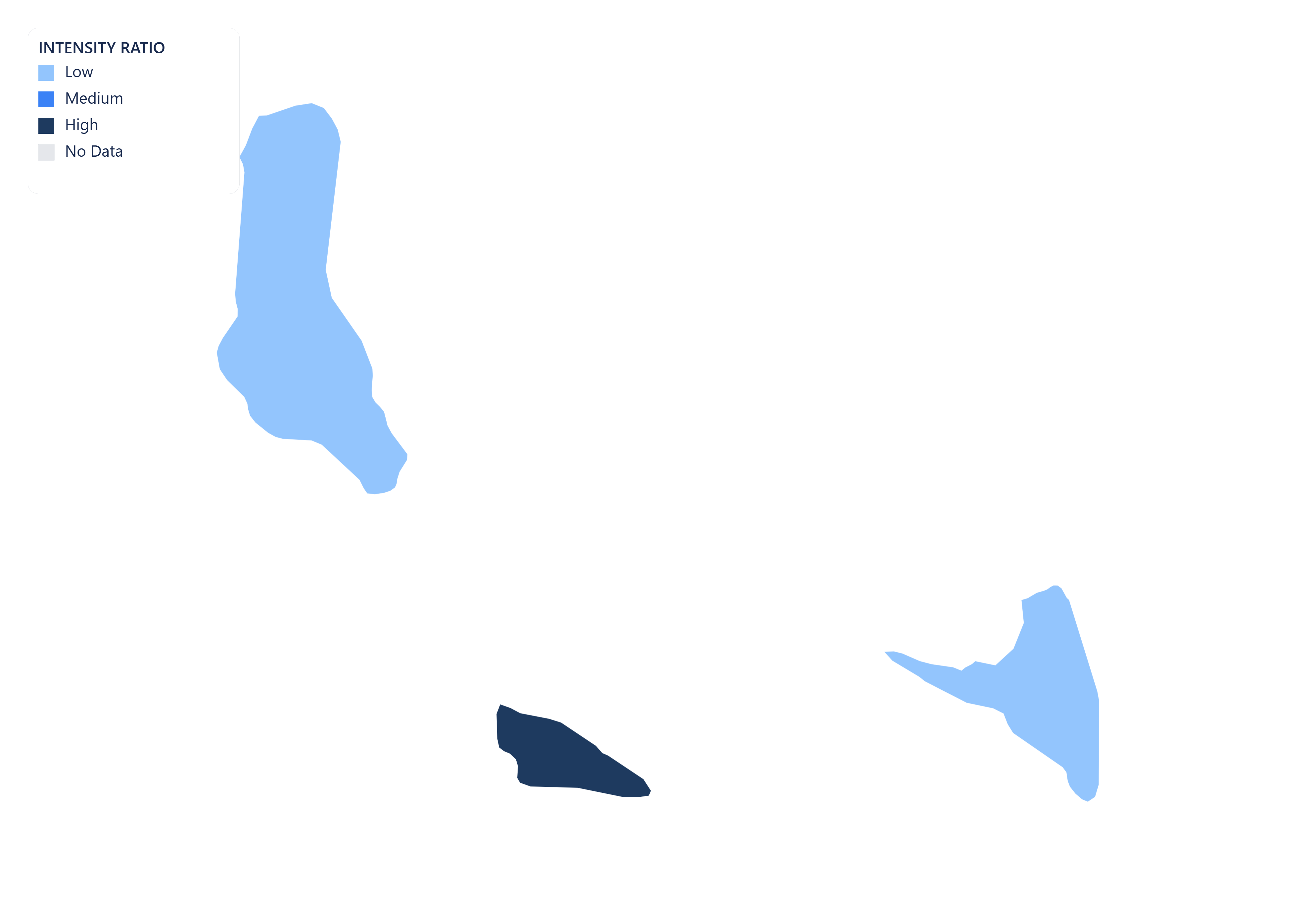
Comoros choropleth map
Visualize Comoros's 3 islands as a choropleth map. Color regions by any numeric dataset — population, GDP, unemployment, health outcomes, and more. Export as PNG, JPEG, or PDF.
Vector SVG export
Export your Comoros map as a scalable vector graphic (SVG). Ideal for print publications, editorial illustrations, and web use — scales to any resolution without quality loss.

Animated GIF
Bring your Comoros data to life. Import historical time-series data and export a looping animated GIF showing how regional values changed over time.
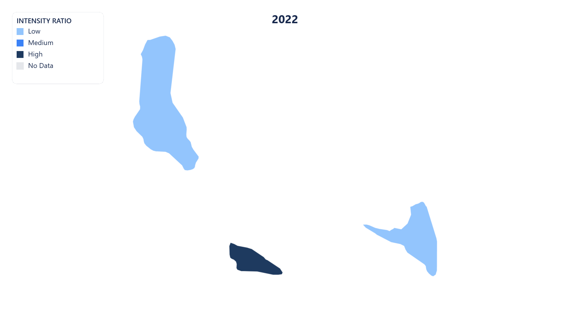
MP4 video export
Export your Comoros time-series map as an MP4 video. Perfect for presentations, reports, and social media posts where motion communicates change more clearly than static images.
Public share page
Share your Comoros choropleth map with a public link. Anyone with the URL can view the full interactive map — no account or login required.
Embeddable iframe
Embed your Comoros choropleth map anywhere with a single line of HTML. The iframe stays live — viewers always see the latest version of your map, no re-publishing needed.
AI-powered data import for Comoros maps
No spreadsheet? No problem. Regionify's AI Agent turns a plain-text description or raw pasted data into a ready-to-visualize dataset in seconds.
AI Generator
Generate Comoros data from a prompt
Describe the dataset you need in plain English — for example "GDP per capita of Comoros's 3 islands in 2023" or "election results by islands" — and the AI generates a plausible, structured dataset that maps directly onto Comoros's administrative boundaries. Edit any values in the table view before saving.
- ✓ Works for population, GDP, health, election, and custom metrics
- ✓ Supports time-series prompts for animated maps
- ✓ Output pre-matched to Comoros's 3 islands
AI Parser
Clean and import messy Comoros data
Paste raw text, a copied Wikipedia table, or an unstructured CSV with regional figures for Comoros. The AI parser normalises region names, strips noise, resolves mismatched spelling across Comoros's islands, and outputs a clean id–label–value table ready to visualise.
- ✓ Handles inconsistent or misspelled islands names
- ✓ Auto-detects time columns for historical data
- ✓ Streams results in real time as AI processes
AI Agent is available on the Chronographer plan.
Islands of Comoros
- Anjouan
- Grande Comore
- Moheli
Build your own Comoros choropleth map — free
Upload any dataset, color Comoros's islands by any numeric metric, and export as PNG, SVG, GIF, or MP4. No design skills required — start in seconds, publish anywhere.