%20ammap.com%20%7C%20SVG%20map%20of%20Japan%20-%20High%20--%3E%0A%3Csvg%20xmlns%3D%22http%3A%2F%2Fwww.w3.org%2F2000%2Fsvg%22%20xmlns%3Aamcharts%3D%22http%3A%2F%2Famcharts.com%2Fammap%22%20xmlns%3Axlink%3D%22http%3A%2F%2Fwww.w3.org%2F1999%2Fxlink%22%20version%3D%221.1%22%20viewBox%3D%220%200%20820%201250%22%20width%3D%22100%25%22%20height%3D%22100%25%22%20preserveAspectRatio%3D%22xMidYMid%20slice%22%3E%0A%09%3Cdefs%3E%0A%09%09%0A%0A%09%09%3Camcharts%3Aammap%20projection%3D%22mercator%22%20leftLongitude%3D%22123.658963%22%20topLatitude%3D%2245.523885%22%20rightLongitude%3D%22145.820743%22%20bottomLatitude%3D%2224.217586%22%3E%3C%2Famcharts%3Aammap%3E%0A%0A%09%09%3C!--%20All%20areas%20are%20listed%20in%20the%20line%20below.%20You%20can%20use%20this%20list%20in%20your%20script.%20--%3E%0A%09%09%3C!--%7Bid%3A%22JP-23%22%7D%2C%7Bid%3A%22JP-05%22%7D%2C%7Bid%3A%22JP-02%22%7D%2C%7Bid%3A%22JP-12%22%7D%2C%7Bid%3A%22JP-38%22%7D%2C%7Bid%3A%22JP-18%22%7D%2C%7Bid%3A%22JP-40%22%7D%2C%7Bid%3A%22JP-07%22%7D%2C%7Bid%3A%22JP-21%22%7D%2C%7Bid%3A%22JP-10%22%7D%2C%7Bid%3A%22JP-28%22%7D%2C%7Bid%3A%22JP-01%22%7D%2C%7Bid%3A%22JP-34%22%7D%2C%7Bid%3A%22JP-08%22%7D%2C%7Bid%3A%22JP-17%22%7D%2C%7Bid%3A%22JP-03%22%7D%2C%7Bid%3A%22JP-39%22%7D%2C%7Bid%3A%22JP-37%22%7D%2C%7Bid%3A%22JP-43%22%7D%2C%7Bid%3A%22JP-14%22%7D%2C%7Bid%3A%22JP-46%22%7D%2C%7Bid%3A%22JP-26%22%7D%2C%7Bid%3A%22JP-24%22%7D%2C%7Bid%3A%22JP-04%22%7D%2C%7Bid%3A%22JP-45%22%7D%2C%7Bid%3A%22JP-15%22%7D%2C%7Bid%3A%22JP-20%22%7D%2C%7Bid%3A%22JP-29%22%7D%2C%7Bid%3A%22JP-42%22%7D%2C%7Bid%3A%22JP-47%22%7D%2C%7Bid%3A%22JP-27%22%7D%2C%7Bid%3A%22JP-33%22%7D%2C%7Bid%3A%22JP-44%22%7D%2C%7Bid%3A%22JP-41%22%7D%2C%7Bid%3A%22JP-25%22%7D%2C%7Bid%3A%22JP-32%22%7D%2C%7Bid%3A%22JP-11%22%7D%2C%7Bid%3A%22JP-22%22%7D%2C%7Bid%3A%22JP-09%22%7D%2C%7Bid%3A%22JP-13%22%7D%2C%7Bid%3A%22JP-36%22%7D%2C%7Bid%3A%22JP-31%22%7D%2C%7Bid%3A%22JP-16%22%7D%2C%7Bid%3A%22JP-30%22%7D%2C%7Bid%3A%22JP-35%22%7D%2C%7Bid%3A%22JP-19%22%7D%2C%7Bid%3A%22JP-06%22%7D--%3E%0A%0A%09%3C%2Fdefs%3E%0A%09%3Cg%3E%0A%09%09%3Cpath%20fill%3D%22white%22%20stroke%3D%22none%22%20id%3D%22JP-23%22%20title%3D%22Aichi%22%20%20d%3D%22M274.27%2C277.6l-0.17%2C-0.35l0.5%2C-1.77l-0.86%2C-1.4l0.11%2C-1.46l0.46%2C-1.37l-0.25%2C-0.32l-0.89%2C0.36l-1.14%2C-0.35l0%2C0l-0.97%2C-1.57l-0.32%2C-1.21l0%2C0l0.22%2C-2.19l1.69%2C-2.97l1.28%2C0.15l1.66%2C-0.5l1.48%2C-1.13l-0.02%2C0.57l1.18%2C0.87l-0.03%2C0.65l0.5%2C0.21l-0.09%2C0.48l0.27%2C0.32l0.32%2C0.15l0.3%2C-0.21l0.94%2C0.39l0.52%2C0.71l0.85%2C-0.17l0.92%2C-0.73l0.63%2C-0.01l0.75%2C0.47l-0.07%2C0.24l0.84%2C0.05l-0.02%2C0.31l0.99%2C0.5l1.72%2C-1.4l0.8%2C-0.08l0%2C0l-0.32%2C0.83l0.64%2C0.81l-0.01%2C0.51l1.26%2C-0.26l0.85%2C-0.55l1.56%2C0.3l0.22%2C0.39l0.84%2C-0.27l0%2C0l-0.31%2C0.98l0.52%2C0.5l-0.58%2C0.57l0.08%2C0.47l-0.46%2C0.24l-1.46%2C2l-0.03%2C1.06l-1.28%2C1.93l-2.75%2C1.53l-0.43%2C1.23l0.16%2C2.32l0%2C0l-3.41%2C0.79l-3.43%2C1.23l-2.03%2C0.27l-0.26%2C-0.21l0.8%2C-1.71l0.49%2C0.05l0.25%2C0.57l2.36%2C-1.02l0.86%2C-0.53l-0.1%2C-0.44l0.45%2C-0.36l0.48%2C0.15l0.22%2C-0.19l0.21%2C-1.14l-0.57%2C-0.7l-1.69%2C-0.31l-0.52%2C0.46l-0.24%2C0.93l-0.81%2C-0.57l-2.13%2C0.25l-1.42%2C-1.37l0.31%2C-1.08l-0.44%2C-0.19l-0.42%2C0.59l-0.27%2C2.22l1.02%2C0.93l0.15%2C0.88l-1.69%2C-0.6L274.27%2C277.6z%22%2F%3E%0A%09%09%3Cpath%20fill%3D%22white%22%20stroke%3D%22none%22%20id%3D%22JP-05%22%20title%3D%22Akita%22%20%20d%3D%22M337.52%2C155.13l-0.69%2C-2.75l-1.39%2C-1.62l0.51%2C-0.81l0.74%2C0.23l0.6%2C0.89l0.19%2C-1.14l-0.26%2C-0.41l0.4%2C-0.61l0.19%2C-1.4l-0.34%2C-1.41l-1.07%2C-0.44l-0.45%2C0.43l-0.54%2C0.81l-0.61%2C2.06l0.54%2C0.42l-0.08%2C1.26l-0.75%2C-0.29l-0.89%2C0.15l-0.19%2C0.25l0.17%2C0.85l-2.1%2C-0.09l-0.96%2C-1.84l-0.22%2C-1.3l0.14%2C-0.73l1.93%2C1.32l0.67%2C-0.21l1.48%2C-1.46l0.87%2C-1.57l0.8%2C-2.39l0.6%2C-3l0.03%2C-1.67l-1.72%2C-1.81l0%2C0l0.51%2C-0.11l1.13%2C0.35l0.26%2C-0.87l0.77%2C-0.35l0.54%2C0.32l0.21%2C0.49l1.48%2C-0.13l0.81%2C0.28l1.35%2C-0.38l0.86%2C0.18l0.5%2C-1l1.31%2C-0.11l0.27%2C0.84l0.8%2C0l1.15%2C1.19l1%2C-0.84l1.25%2C0.84l0.79%2C-0.63l0.76%2C-0.05l0.72%2C-0.62l0.71%2C0.1l0.24%2C-1.08l1.23%2C-0.49l-0.16%2C2.35l2.13%2C-0.23l0.28%2C1.84l-0.41%2C0.27l-0.5%2C1.22l0.14%2C1.31l0%2C0l-0.4%2C0.57l-0.61%2C0.22l-0.81%2C1.11l0.4%2C0.49l-0.15%2C1.56l-0.52%2C0.46l-0.05%2C2.68l0.62%2C2.5l-0.56%2C0.18l-0.49%2C-0.48l-0.82%2C0.45l0.07%2C1.06l1.12%2C0.66l-0.82%2C1.47l-0.39%2C0.14l0.66%2C1.17l0.13%2C1.08l-0.51%2C1.19l-0.27%2C-0.03l-0.61%2C0.86l-0.42%2C0.11l0.21%2C0.72l-0.43%2C1.34l-0.78%2C0.85l0.05%2C0.81l-0.45%2C0.12l-0.05%2C0.65l0.39%2C0.09l0.6%2C1.25l-0.15%2C0.92l0.53%2C0.75l1.12%2C0.77l-0.33%2C1.06l0.85%2C0.44l-0.6%2C0.3l-0.47%2C0.83l0.27%2C0.22l-0.28%2C0.97l0.97%2C0.38l0.14%2C0.4l-0.79%2C1.37l0.08%2C1.15l0%2C0l-0.71%2C0.17l-1.64%2C1.57l-1.76%2C0.36l-0.27%2C-0.18l0%2C0l-0.24%2C-0.45l-1.52%2C-0.53l-0.58%2C-1.8l-1.06%2C-0.08l-0.35%2C-0.77l-1.08%2C0.27l-3.08%2C-0.94l-0.79%2C-0.7l-0.71%2C-0.18l-0.2%2C-1.17l-0.98%2C0.24l-0.37%2C0.46l-2.51%2C-0.41l0%2C0l0.68%2C-1.47l-0.23%2C-0.93l0.39%2C-0.78l-0.04%2C-0.53l0.39%2C-0.61l0.7%2C-0.11l0.94%2C-2.39l0.8%2C-4.19L337.52%2C155.13z%22%2F%3E%0A%09%09%3Cpath%20fill%3D%22white%22%20stroke%3D%22none%22%20id%3D%22JP-02%22%20title%3D%22Aomori%22%20%20d%3D%22M358.65%2C125.37l0.92%2C-0.83l0.58%2C-1.05l0.57%2C-1.85l0.23%2C-2.45l0.59%2C-1.14l-0.72%2C-2.06l-0.86%2C-1.04l-0.79%2C-0.08l-0.85%2C1.61l-1.13%2C0.81l-1.52%2C-0.42l-0.67%2C0.65l-1.81%2C0.34l-0.85%2C0.87l-0.93%2C-0.47l0.69%2C-4.59l0.42%2C-0.66l0.31%2C-1.84l1.43%2C-2.03l-0.22%2C-0.82l0.3%2C-0.55l1.72%2C1.57l1.32%2C0.11l0.89%2C0.5l1.57%2C1.97l1.46%2C0.85l0.89%2C0.11l1%2C-0.37l2.04%2C-1.67l-1.49%2C6.85l-0.1%2C5.09l0.55%2C5.55l1.37%2C4.86l1.18%2C1.09l0.67%2C-0.39l0.23%2C0.55l1.91%2C1.89l0%2C0l-0.47%2C0.54l-1.39%2C0.62l-0.11%2C0.83l-0.89%2C0.69l-1.24%2C-0.77l-0.68%2C0.09l-1.72%2C1.1l-0.68%2C-1.08l-1.96%2C1.49l-1.52%2C0.38l-0.74%2C0.5l-0.04%2C0.72l-0.46%2C0.02l-1%2C0.78l-0.94%2C-0.01l-0.46%2C-0.68l0%2C0l-0.14%2C-1.31l0.5%2C-1.22l0.41%2C-0.27l-0.28%2C-1.84l-2.13%2C0.23l0.16%2C-2.35l-1.23%2C0.49l-0.24%2C1.08l-0.71%2C-0.1l-0.72%2C0.62l-0.76%2C0.05l-0.79%2C0.63l-1.25%2C-0.84l-1%2C0.84l-1.15%2C-1.19l-0.8%2C0l-0.27%2C-0.84l-1.31%2C0.11l-0.5%2C1l-0.86%2C-0.18l-1.35%2C0.38l-0.81%2C-0.28l-1.48%2C0.13l-0.21%2C-0.49l-0.54%2C-0.32l-0.77%2C0.35l-0.26%2C0.87l-1.13%2C-0.35l-0.51%2C0.11l0%2C0l0.26%2C-1.78l-0.19%2C-1.44l-0.45%2C-0.86l-0.96%2C0.05l-0.15%2C-0.82l1.78%2C-1.42l1.02%2C-1.8l0.65%2C-0.44l0.61%2C-0.25l1.23%2C0.69l1.43%2C-1.07l0.81%2C-0.1l0.42%2C-0.61l1.02%2C-3.61l0.07%2C-3.8l-0.69%2C-0.75l-0.7%2C-0.08l0.17%2C-0.39l0.88%2C0.23l0.38%2C-0.43l0.4%2C-2.95l1.09%2C0.69l0.67%2C0.99l0.64%2C0.36l0.67%2C-0.19l1%2C-1.01l1.09%2C0.38l0.65%2C0.72l-0.11%2C2.27l0.39%2C2.52l0.73%2C3.28l0.93%2C1.19l1.33%2C-0.11l1.19%2C-1.28l0.22%2C-0.56l-0.22%2C-1.24l0.33%2C-1.45l1.49%2C0.54l0.68%2C0.96l-0.18%2C0.55l0.73%2C-0.01l0.92%2C0.45l0.53%2C0.88L358.65%2C125.37z%22%2F%3E%0A%09%09%3Cpath%20fill%3D%22white%22%20stroke%3D%22none%22%20id%3D%22JP-12%22%20title%3D%22Chiba%22%20%20d%3D%22M333.18%2C262.84l0.14%2C-0.21l0.96%2C0.42l0.39%2C-0.47l-0.3%2C-0.72l0.09%2C-0.58l1.35%2C-0.38l-0.12%2C-0.51l0.28%2C-0.13l0.24%2C0.38l1.51%2C-2.16l0.57%2C0.45l0.23%2C-0.35l-0.54%2C-1.29l-0.76%2C-0.83l-1.21%2C-1.19l-0.69%2C0.29l-0.35%2C-0.76l0%2C0l-1.08%2C-2.26l0%2C0l0.34%2C-0.26l0.22%2C-1.33l-1.68%2C-3.22l-0.05%2C-1.04l-0.71%2C-1.41l0%2C0l0.42%2C0.03l0.33%2C0.84l1.63%2C2.01l0.72%2C0.24l0.2%2C0.71l1.04%2C0.7l2.46%2C0.86l0.58%2C0.72l1.02%2C-0.41l0.86%2C0.11l0.59%2C-0.4l0.8%2C0.23l0.86%2C-0.82l2.01%2C-0.52l1.08%2C0.52l0.91%2C-0.04l1.13%2C0.97l1.23%2C0.26l1.11%2C1.53l2.5%2C1.54l0%2C0l-0.11%2C0.65l-0.76%2C-0.51l-1.5%2C0.5l-0.8%2C-0.22l-0.75%2C0.19l-2.72%2C2.07l-1.39%2C1.57l-1.12%2C2.16l-0.29%2C2.32l0.47%2C1.23l-0.61%2C2.85l-0.67%2C0.14l-0.47%2C1.02l-0.28%2C0.1l-2.15%2C0.62l-0.23%2C-0.44l-1.28%2C0.19l-0.81%2C1.1l-1.97%2C1.36l-0.51%2C1.21l0.1%2C0.58l-0.45%2C0.61l-1.04%2C0.43l-1.17%2C-0.21l-0.19%2C-0.72l-1.31%2C-0.67l0.03%2C-0.29l0.8%2C0.11l1.25%2C-0.56l-0.78%2C-1.66l0.46%2C-0.5l-0.36%2C-0.36l0.29%2C-0.7l-0.41%2C-0.57l0.01%2C-0.83l0.92%2C-0.71l0.08%2C-0.52l-0.44%2C-0.75l0.06%2C-0.39l-0.75%2C-0.46L333.18%2C262.84z%22%2F%3E%0A%09%09%3Cpath%20fill%3D%22white%22%20stroke%3D%22none%22%20id%3D%22JP-38%22%20title%3D%22Ehime%22%20%20d%3D%22M188.1%2C312.49l0.23%2C-0.43l0.35%2C-0.26l0.35%2C0.04l0.02%2C-0.2l-0.29%2C-0.13l-0.38%2C-0.16l-0.47%2C0.16l-0.28%2C0.23l-0.44%2C-0.25l-0.2%2C0.38l-0.4%2C-0.13l-0.14%2C-0.23l-0.46%2C0l0.13%2C-0.45l0.17%2C-0.13l0.14%2C-0.1l0.31%2C-0.12l-0.03%2C-0.17l-0.04%2C-0.25l-0.3%2C0.03l-0.22%2C-0.37l0.35%2C-0.29l-0.07%2C-0.36l-0.27%2C-0.07l0.35%2C-0.32l0.16%2C-0.04l0.22%2C-0.27l0.09%2C-0.46l-0.23%2C0.13l-0.4%2C-0.05l0.17%2C-0.41l-0.51%2C0.1l-0.33%2C-0.36l-0.23%2C0.06l-0.35%2C0.29l-0.86%2C0.6l-0.52%2C0.14l-0.33%2C0.37l-1.1%2C0.33l-0.57%2C0.53l-0.16%2C0.31l-0.31%2C0.28l-0.51%2C0.06l-0.03%2C-0.24l0.35%2C-0.22l0.01%2C-0.17l-0.51%2C0.02l-0.85%2C0.71l-0.51%2C0.31l-0.25%2C0.01l2.15%2C-1.81l0.51%2C-0.3l0.66%2C-0.36l0.57%2C0.08l0.31%2C-0.33l0.31%2C-0.14l0.46%2C-0.04l0.24%2C-0.14l0.1%2C-0.18l1.16%2C-0.52l0.86%2C-0.64l0.75%2C-0.4l0.21%2C-0.5l0.83%2C-0.99l0.63%2C-0.46l1.55%2C-0.56l1.22%2C-0.91l0.21%2C-0.24l0.37%2C-0.98l0.45%2C-0.4l-0.23%2C-0.72l-0.01%2C-0.99l0.2%2C-1.04l0.24%2C-0.66l0.43%2C0.17l0.43%2C-0.29l0.34%2C-1.22l0.07%2C-0.62l1.77%2C-1.67l1.11%2C-0.17l-0.06%2C-0.45l0.26%2C-0.17l-0.15%2C-0.56l0.36%2C-0.6l0.75%2C0.87l0.98%2C1.41l0.72%2C1.48l0.38%2C0.6l0.13%2C0.43l0.5%2C0.36l0.95%2C-0.32l1.38%2C-0.34l0.37%2C-0.1l-0.12%2C-0.46l1.2%2C-0.2l0.24%2C-0.26l0.38%2C0.05l0.37%2C0.33l0.7%2C-0.3l0.68%2C0.1l0.48%2C0.1l0.73%2C0.33l0.5%2C-0.07l0.69%2C-0.5l0.2%2C-0.34l0.14%2C-0.44l0.16%2C-0.08l0.4%2C-0.27l0%2C0l0.33%2C0.27l0.95%2C0.13l0.61%2C0.34l0%2C0l-0.29%2C0.68l0.27%2C0.49l0%2C1.04l-0.22%2C0.61l-0.34%2C0.29l0%2C0l-0.41%2C0.01l-0.65%2C-0.01l-0.47%2C0.33l-0.51%2C-0.34l-0.21%2C0.04l-0.56%2C0.77l-0.21%2C0.27l-0.2%2C0.16l-2.07%2C0.07l-0.8%2C-0.13l-1.47%2C0.02l-0.2%2C0.17l-0.22%2C0.73l-0.18%2C0.11l-0.52%2C0.19l-0.34%2C-0.34l-0.2%2C0.02l-0.26%2C0.69l-0.39%2C0.79l-0.4%2C0.4l-0.35%2C0.5l-0.06%2C0.55l-0.22%2C0.28l-0.61%2C0.1l-0.18%2C0.65l-0.25%2C0.73l-0.19%2C0.46l0.29%2C0.29l0.04%2C0.52l-0.36%2C0.27l-0.57%2C0.88l-0.01%2C0.27l-1.2%2C0.34l-0.21%2C-0.13l-0.66%2C0.08l-1.3%2C-0.21l-0.41%2C0.11l-0.32%2C0.3l0.35%2C0.32l0.15%2C0.94l0.15%2C0.2l0.2%2C0l0.23%2C0.72l0.45%2C0.14l0.27%2C0.36l0.04%2C0.57l-0.08%2C0.22l-0.8%2C0.46l-1.21%2C0.42l-0.31%2C0.52l-0.18%2C1.14l-0.43%2C0.03l-0.17%2C0.15l-0.14%2C0.47l-0.71%2C0.9l-0.19%2C0.07l-0.95%2C-0.92l-0.11%2C-0.27l-0.2%2C0.07l-0.14%2C0.29l0.29%2C0.62l-0.03%2C0.26l0.47%2C0.51l0.21%2C0.05l0.09%2C0.3l-0.2%2C0.92l0.3%2C0.31l0.21%2C0.94l-0.01%2C1.33l-0.41%2C0.1l-0.05%2C0.38l0%2C0l-0.32%2C-0.12l-0.94%2C0.35l-0.14%2C-0.27l-0.25%2C-0.34l-0.09%2C-0.18l-0.46%2C0.16l-0.19%2C0.09l-0.26%2C0.06l-0.02%2C0.29l0.02%2C0.13l-0.19%2C0.26l-0.35%2C-0.03l-0.27%2C0.01l-0.25%2C-0.04l0.08%2C-0.37l-0.32%2C-0.38l0.1%2C-0.12l0.36%2C-0.04l0.35%2C-0.26l-0.63%2C-0.34l0.28%2C-0.23l0.24%2C0.14l0.15%2C0.04l0.14%2C-0.1l-0.21%2C-0.39l0.1%2C-0.26l-0.3%2C-0.14l-0.12%2C-0.04l-0.01%2C-0.83l-0.28%2C-0.04l-0.35%2C0.33l-0.42%2C-0.24l-0.38%2C0.17l-0.13%2C0.08l-0.09%2C0.21l-0.05%2C0.29l-0.36%2C-0.18l0.33%2C-0.4l0.02%2C-0.38l0.15%2C-0.35l0.22%2C-0.05l0.2%2C0.11l0.14%2C0.34l0.33%2C-0.06l0.57%2C-0.22l0.13%2C-0.27l-0.3%2C-0.12l0.21%2C-0.39l0.38%2C-0.6l-0.02%2C-0.33l-0.39%2C-0.09l-0.15%2C0.01l-0.22%2C0.08l-0.15%2C0.13l-0.22%2C-0.14l0.05%2C-0.25l-0.36%2C-0.17l0.15%2C-0.33l0.29%2C-0.35l-0.52%2C-0.56l0.51%2C0.2l0.69%2C0.34l0.29%2C0.33l0.35%2C0.02l-0.08%2C-0.37l-0.2%2C-0.41l0.31%2C-0.27l0.56%2C0.04l0.23%2C-0.03l0.09%2C-0.16l-0.14%2C-0.34l-0.28%2C0.04l-0.38%2C-0.34l0.39%2C-0.21l0.04%2C-0.31l-0.8%2C0.05L188.1%2C312.49z%22%2F%3E%0A%09%09%3Cpath%20fill%3D%22white%22%20stroke%3D%22none%22%20id%3D%22JP-18%22%20title%3D%22Fukui%22%20%20d%3D%22M252.29%2C257.91l1.16%2C0.72l0.07%2C0.38l0.31%2C-0.04l0.42%2C-0.26l-0.65%2C-0.81l0.2%2C-0.13l0.54%2C0.36l0.37%2C-0.65l-0.58%2C-0.45l-0.25%2C-0.84l0.59%2C0.15l0.43%2C0.69l0.76%2C-0.4l0.15%2C0.35l1.22%2C-0.36l0.23%2C-0.43l-0.25%2C-0.32l0.06%2C-0.95l-0.43%2C-0.68l1.24%2C-0.99l0.39%2C0.6l-0.23%2C1.43l0.36%2C0.54l0.6%2C-0.11l0.48%2C-1.52l0.02%2C-1.28l-0.57%2C-1.13l-1.52%2C-1.52l0.08%2C-1.1l-0.79%2C-1.19l1.06%2C-1.27l0.35%2C-1.49l2.1%2C-3.09l-0.24%2C-0.66l0.85%2C0l1.53%2C-1.09l0%2C0l1.68%2C1.59l0.25%2C1.25l0.41%2C0.38l0.9%2C-0.13l0.65%2C0.76l0.47%2C0.05l1.75%2C-0.42l1.86%2C1.46l0.24%2C0.62l1.89%2C-0.48l0%2C0l0.21%2C0.49l-0.49%2C0.37l-0.25%2C1.39l0.5%2C0.37l-0.05%2C0.53l0.79%2C0.28l-0.13%2C0.49l0.64%2C0.53l0.3%2C1.22l-0.63%2C0.46l-0.17%2C0.78l-1.34%2C-0.02l-1.13%2C0.49l-0.42%2C-0.52l-0.46%2C0.45l-0.52%2C-0.17l-0.49%2C0.44l-0.82%2C-0.21l-0.56%2C0.77l-0.3%2C-0.51l-1.06%2C0.02l-1.17%2C-0.42l-0.9%2C0.48l-0.01%2C0.97l-0.99%2C1.64l0%2C0l-1.81%2C-0.94l-0.67%2C0.13l-0.31%2C0.67l0.83%2C1.76l-0.13%2C0.75l-1.1%2C-0.32l-0.35%2C1.07l-1.29%2C0.13l-0.45%2C0.87l-0.46%2C0.1l-0.77%2C-0.77l-1.04%2C2.77l-0.57%2C0.28l-0.35%2C-0.4l-0.66%2C-0.01l-0.05%2C0.5l-0.37%2C0.1l-0.45%2C0.74l0%2C0l-1.37%2C0.26l-1.51%2C-0.59l-1.73%2C-0.19l-0.13%2C-0.87l-1.31%2C-1.21l0.29%2C-1l-0.52%2C-0.42l0.41%2C-0.9l0%2C0l0.88%2C0.17l-0.21%2C1.09l0.18%2C0.25l2.58%2C0.39l1.78%2C-0.38l0.27%2C-0.88l-0.65%2C0.27l-0.03%2C-0.5l-0.57%2C-0.11l0.52%2C-0.59L252.29%2C257.91z%22%2F%3E%0A%09%09%3Cpath%20fill%3D%22white%22%20stroke%3D%22none%22%20id%3D%22JP-40%22%20title%3D%22Fukuoka%22%20%20d%3D%22M147.17%2C302.8l1.24%2C-1.35l0.14%2C-0.6l-0.12%2C-0.36l-0.33%2C0.01l-0.06%2C-0.68l0.56%2C-0.05l0.25%2C-0.81l0.85%2C-0.52l-0.08%2C-0.39l0.78%2C-0.03l0.25%2C0.3l1.04%2C-0.11l0.68%2C-0.4l0.71%2C-0.94l1.1%2C0.45l0.45%2C-0.34l1.79%2C0.39l0.43%2C0.58l0.74%2C-0.28l0.32%2C-0.77l1.16%2C-0.76l0.4%2C0.31l-0.72%2C1.35l0.17%2C0.96l-0.79%2C0.7l0.22%2C0.46l0.66%2C-0.13l0.55%2C2.53l1.4%2C2.1l0.56%2C-0.28l1.08%2C0.76l0%2C0l-0.15%2C0.37l0.3%2C0.8l-0.39%2C0.52l0.13%2C0.46l-1.91%2C0.11l-0.97%2C-0.27l-0.93%2C0.23l-1.61%2C1.38l-0.3%2C1.65l-0.49%2C0.13l-0.47%2C0.69l0.3%2C0.16l0.29%2C0.95l-0.14%2C0.64l-0.52%2C0.26l-0.12%2C0.38l0.36%2C0.19l-0.03%2C0.62l0.84%2C0.73l-0.48%2C1.38l-0.35%2C0.25l0%2C0l-1.53%2C-0.52l-0.67%2C-0.61l-0.81%2C0.04l-0.16%2C-0.4l-0.53%2C1.44l-1.5%2C-0.17l-1.62%2C1.49l0.18%2C1.07l-2.14%2C-0.08l0%2C0l0.48%2C-1.1l-0.32%2C-0.8l-0.74%2C-0.78l0.03%2C-0.41l-0.37%2C-0.19l0%2C0l0.17%2C-1.23l0.59%2C-1.04l1.85%2C-1.42l0.51%2C-0.86l0.51%2C0.03l0.02%2C-2.25l-0.41%2C-0.21l-0.74%2C0.25l-0.99%2C0.95l-0.62%2C-0.71l-0.77%2C-0.17l-1.7%2C-1.07L144.2%2C308l-0.86%2C-0.24l-0.69%2C0.32l-2.63%2C-0.08l0%2C0l0.15%2C-0.68l1.61%2C-0.32l0.54%2C-0.64l0.19%2C-0.55l-0.42%2C0.3l-0.15%2C-0.45l-0.27%2C-0.16l-0.45%2C0.24l-0.22%2C-0.4l1.19%2C-0.35l0.29%2C-0.38l-0.12%2C-0.38l0.85%2C-0.3l0.15%2C-0.61l0.59%2C0.4l-0.25%2C0.37l0.18%2C0.42l0.82%2C0.14l0.11%2C0.7l0.48%2C-0.08l0.16%2C-0.34l0.66%2C0.07l1.04%2C-0.49l0.12%2C-0.84l0.57%2C-0.23l-0.08%2C-0.6L147.17%2C302.8z%22%2F%3E%0A%09%09%3Cpath%20fill%3D%22white%22%20stroke%3D%22none%22%20id%3D%22JP-07%22%20title%3D%22Fukushima%22%20%20d%3D%22M355.44%2C223.47l-0.62%2C0.81l-2.49%2C1.19l-0.39%2C0.66l0.04%2C0.48l0%2C0l-3.43%2C-1.04l-0.57%2C-1.03l-0.34%2C0.46l0.46%2C1.3l-1.12%2C0.49l-1.46%2C1.4l-0.43%2C-0.57l-1.14%2C-0.42l-0.33%2C-1.16l-0.82%2C-0.25l-0.76%2C-1.02l-0.55%2C-0.03l0%2C0l-0.33%2C-0.33l0.16%2C-1.86l-0.85%2C0.05l-0.23%2C-0.94l-1.02%2C-0.98l-2.39%2C-1l-2.41%2C-0.28l-1.36%2C0.59l-0.18%2C0.91l-2.79%2C0.87l-0.26%2C0.42l-0.79%2C0.19l-0.23%2C0.44l-0.63%2C0.09l-0.92%2C0.74l-1.36%2C0.24l-0.71%2C1.02l-0.94%2C0.43l0%2C0l-2.3%2C-0.72l-0.52%2C0.2l-0.01%2C-0.37l0%2C0l0.24%2C-0.42l-0.11%2C-1.34l0.22%2C-0.78l-0.42%2C-1.39l0.35%2C-1.28l-0.47%2C-0.93l-0.68%2C-0.16l-0.59%2C-0.8l0.97%2C-1.4l0.2%2C-1.16l0.14%2C-1.19l-0.67%2C-0.56l0.57%2C-0.92l2.15%2C-0.24l0.55%2C-0.29l0.68%2C0.24l0.32%2C-1.19l0.41%2C-0.16l0.47%2C-0.04l0.39%2C0.32l0.37%2C-0.24l1.26%2C0.22l0.48%2C-0.23l-0.38%2C-0.82l0.09%2C-0.81l-0.42%2C-1.03l0.03%2C-0.73l1.53%2C-1.04l-0.13%2C-0.24l0.71%2C-1.3l1.58%2C-1.71l0%2C0l0.79%2C-0.18l0.63%2C0.68l0.94%2C-0.58l0.61%2C0.39l0.63%2C-0.07l0.33%2C-0.35l0.97%2C1.68l1.23%2C-0.46l1.47%2C1.12l0.74%2C-0.56l1.3%2C0.26l1.33%2C-1.61l-0.55%2C-0.41l-0.04%2C-2.01l0.3%2C-1.71l0%2C0l1.39%2C0.66l1.13%2C-0.57l1.14%2C0.69l0.37%2C1.09l2.65%2C-0.27l0.82%2C0.28l0.56%2C0.46l-0.18%2C1.14l0.28%2C0.75l0.63%2C0.5l1.21%2C0.27l0.15%2C-0.16l-0.47%2C-0.39l1.58%2C0.06l0.13%2C-0.22l-0.03%2C-2.17l0.72%2C-0.27l0.69%2C0.18l0%2C0l0.38%2C1.28l0.71%2C0.43l0.05%2C1.28l0.44%2C0.75l0.55%2C6.03l0%2C3.31L355.44%2C223.47zM352.01%2C226.63L352.01%2C226.63l0.03%2C0.01L352.01%2C226.63z%22%2F%3E%0A%09%09%3Cpath%20fill%3D%22white%22%20stroke%3D%22none%22%20id%3D%22JP-21%22%20title%3D%22Gifu%22%20%20d%3D%22M265.76%2C266.48L265.04%2C265.79L265.36%2C265.58L265.38%2C264.65L265.7%2C264.13L265.74%2C262.79L266.29%2C262.35L265.76%2C261.5L265.85%2C260.5L265.22%2C259.86L265.46%2C258.97L264.91%2C258.26L264.6%2C258.76L263.82%2C258.47L263.94%2C256.87L263.28%2C256.8L263.02%2C255.73L263.02%2C255.73L264%2C254.09L264.01%2C253.12L264.91%2C252.64L266.08%2C253.06L267.14%2C253.05L267.44%2C253.56L268%2C252.79L268.82%2C253.01L269.3%2C252.57L269.82%2C252.74L270.28%2C252.3L270.69%2C252.82L271.82%2C252.33L273.17%2C252.35L273.34%2C251.57L273.96%2C251.11L273.66%2C249.89L273.02%2C249.37L273.14%2C248.88L272.35%2C248.6L272.4%2C248.07L271.91%2C247.7L272.15%2C246.31L272.65%2C245.94L272.44%2C245.45L272.44%2C245.45L272.94%2C244.36L272.71%2C243.62L273.32%2C243.39L274.26%2C241.72L274.22%2C241.33L273.46%2C240.9L273.21%2C240.32L273.21%2C240.32L273.79%2C240.24L274.08%2C239.18L274.85%2C238.62L275.1%2C239.21L275.45%2C238.85L276.37%2C239.36L276.71%2C240.13L276.45%2C240.86L276.79%2C240.94L278.18%2C239.72L278.43%2C238.57L280.51%2C236.55L281.06%2C236.53L281.31%2C236.97L282.77%2C236.28L283.36%2C236.33L283.4%2C237.21L283.61%2C237.25L284.96%2C236.45L285.24%2C237.23L286.37%2C237.58L287.08%2C237.24L287.92%2C238.06L288.86%2C238.13L288.86%2C238.13L288.99%2C238.64L290.02%2C239.3L290.11%2C239.83L290.02%2C240.61L288.63%2C242.42L289.01%2C242.97L288.96%2C243.49L288.21%2C244.2L288.2%2C245.01L288.66%2C245.51L289.38%2C245.76L288.99%2C247.33L287.99%2C248.09L287.62%2C249.01L287.18%2C249.11L286.66%2C250.17L286.24%2C250.24L285.91%2C249.91L284.76%2C250.26L284.41%2C251.32L283.82%2C251.57L283.71%2C252.11L284%2C252.5L285.04%2C252.51L285.09%2C253.02L286.32%2C253.39L287.12%2C255.18L287.9%2C255.88L287.47%2C257.16L287.86%2C257.61L287.79%2C258.71L288.1%2C259.26L289.17%2C258.94L289.74%2C259.48L289.74%2C260.39L289.09%2C261.09L289.8%2C262.07L288.93%2C262.36L289.19%2C263.63L288.35%2C264.28L288.36%2C264.81L288.36%2C264.81L287.56%2C264.89L285.84%2C266.29L284.85%2C265.8L284.87%2C265.48L284.03%2C265.44L284.1%2C265.2L283.35%2C264.72L282.72%2C264.74L281.8%2C265.47L280.95%2C265.64L280.43%2C264.93L279.49%2C264.54L279.19%2C264.75L278.87%2C264.6L278.6%2C264.28L278.69%2C263.79L278.2%2C263.59L278.23%2C262.94L277.05%2C262.07L277.07%2C261.51L275.58%2C262.63L273.92%2C263.13L272.65%2C262.98L270.96%2C265.96L270.74%2C268.15L270.74%2C268.15L269.66%2C268.03L267.97%2C265.53z%22%2F%3E%0A%09%09%3Cpath%20fill%3D%22white%22%20stroke%3D%22none%22%20id%3D%22JP-10%22%20title%3D%22Gunma%22%20%20d%3D%22M329.7%2C242.25L329.39%2C242.83L328.9%2C243.01L328.38%2C242.53L325.84%2C243.01L324.03%2C241.67L323.17%2C241.88L322.2%2C241.59L321.6%2C241.74L319.91%2C240.88L319.21%2C240.83L317.98%2C242.8L317.96%2C243.73L317.54%2C244.49L316.01%2C244.56L315.55%2C245.34L314.03%2C245.74L313.11%2C246.75L311.88%2C246.77L311.13%2C247.78L311.13%2C247.78L310.77%2C247.87L310.41%2C247.35L309.8%2C247.16L309.42%2C245.39L309.75%2C245.04L309.47%2C244.37L308.82%2C244.29L308.38%2C243.53L308.54%2C243.36L309%2C243.69L309.45%2C243.21L309.48%2C242.4L309.06%2C241.96L308.83%2C240.85L309.86%2C240.17L309.93%2C238.69L309.64%2C237.54L308.81%2C237.29L308.11%2C237.39L307.67%2C237.79L306.79%2C237.54L306.58%2C237.85L306.15%2C237.78L304.9%2C237.04L304.84%2C235.74L305.44%2C234.08L305.42%2C233.09L306.38%2C231.91L307.34%2C231.75L307.35%2C230.66L309.14%2C230.3L310.69%2C229.47L310.69%2C229.47L310.94%2C229.64L311.3%2C229.01L312.5%2C229.45L313.29%2C228.78L313.19%2C227.78L313.83%2C227.81L315.32%2C227.19L315.07%2C226.75L315.36%2C225.8L316.21%2C225.91L316.3%2C225.65L316.03%2C223.72L317.67%2C223.44L318.49%2C222.71L318.61%2C221.76L320.15%2C223.31L320.26%2C224.07L321.18%2C224.14L321.41%2C224.48L321.41%2C224.48L321.42%2C224.85L321.94%2C224.65L324.24%2C225.36L324.24%2C225.36L323.66%2C226.9L324.68%2C227.34L323.66%2C228.75L323.94%2C229.92L323.35%2C230.81L323.17%2C232.18L324.64%2C232.92L325.87%2C232.85L326.21%2C233.53L325.39%2C234.18L324.99%2C235.38L325.32%2C236.14L324.13%2C237.69L323.95%2C238.65L325%2C239.43L324.96%2C240.01L326.07%2C240.98L327.08%2C240.69L327.79%2C241.12L328.9%2C240.94L329.28%2C241.18L329.19%2C241.46z%22%2F%3E%0A%09%09%3Cpath%20fill%3D%22white%22%20stroke%3D%22none%22%20id%3D%22JP-28%22%20title%3D%22Hyogo%22%20%20d%3D%22M227.25%2C277.27l-1.09%2C0.9l-1.21%2C-0.22l0%2C0l-0.54%2C-1.37l-1.08%2C-0.96l-0.18%2C-0.47l0.7%2C-1.31l-0.68%2C-0.85l0.35%2C-0.32l0.15%2C-0.91l-0.2%2C-0.59l0.92%2C-0.54l0.06%2C-0.93l0.59%2C-0.25l0.24%2C-1.1l0.24%2C-0.26l0.67%2C0.07l0.08%2C-0.78l-0.63%2C-0.66l0.44%2C-0.8l0%2C0l0.58%2C0.26l1.64%2C-1.15l-0.26%2C-1.16l0.15%2C-0.43l-0.73%2C-0.96l0.09%2C-1.08l-0.73%2C-0.34l-0.49%2C-1.88l0.12%2C-1.02l-0.38%2C-0.77l-0.69%2C-0.52l0%2C0l2.13%2C-0.66l1.22%2C-0.74l1.2%2C0.31l0.42%2C0.47l0.82%2C-0.67l1.38%2C0.2l1.28%2C-0.29l0.45%2C0.33l0.98%2C-0.06l0%2C0l0.02%2C2.02l0.86%2C0.8l0.21%2C0.61l0.72%2C0.18l1.33%2C-0.66l0.32%2C0.54l0%2C2.63l-0.91%2C0.52l-1.14%2C-0.55l-0.37%2C1l0.02%2C1.27l1.49%2C0.61l1.32%2C1.13l0.76%2C-0.46l1.02%2C0.02l0.02%2C0.78l0.86%2C0.82l-0.25%2C0.55l0.55%2C0.24l0.43%2C-0.36l0.81%2C0.04l0.22%2C0.06l0.04%2C0.73l0.85%2C-0.18l0.97%2C0.49l0.29%2C1.26l-0.38%2C0.21l-0.17%2C0.54l0%2C0l-0.43%2C-0.05l-0.29%2C0.31l0.4%2C0.24l0.08%2C0.97l-0.24%2C0.36l1.4%2C0.81l0.96%2C0.14l-0.91%2C0.51l0.43%2C0.25l-0.47%2C2.04l0.74%2C1.24l0.15%2C1.43l-0.54%2C1.21l0%2C0l-0.44%2C-0.33l0.14%2C-0.47l-0.25%2C-0.52l-0.92%2C0.32l-0.42%2C-0.6l-0.97%2C-0.13l-1.98%2C0.94l-0.1%2C0.68l-2.58%2C0.64l-4.27%2C-1.72l-1.67%2C-1.65L227.25%2C277.27zM236.65%2C288.35l0.22%2C0.77l-2.06%2C0.84l-0.98%2C0.82l-1.34%2C0.19l-0.01%2C-0.45l-0.59%2C-0.31l0.06%2C-0.5l-0.43%2C-0.16l-0.54%2C-1.01l0.67%2C-0.96l0.38%2C0.24l0.47%2C-0.24l1.33%2C-2.82l0.4%2C-0.46l0.41%2C0.01l0.95%2C-1.5l0.95%2C-0.43l0.77%2C-1.12l0.55%2C-0.29l0.44%2C0.83l-0.6%2C0.72l-0.15%2C0.77l-1.78%2C2.33l-0.01%2C1.54L236.65%2C288.35z%22%2F%3E%0A%09%09%3Cpath%20fill%3D%22white%22%20stroke%3D%22none%22%20id%3D%22JP-01%22%20title%3D%22Hokkaido%C2%8D%22%20%20d%3D%22M344.04%2C71.29l2.71%2C-2.13l0.04%2C-0.59l-1.96%2C-3.17l-1.38%2C-0.99l-0.7%2C-1.16l0.68%2C-2.54l-0.27%2C-0.48l1.64%2C0.11l0.6%2C-0.42l0.21%2C-0.54l0.53%2C-0.21l2.75%2C2.66l1.93%2C0.87l1.13%2C1.28l2.48%2C-0.47l0.17%2C-0.42l1.02%2C-0.32l0.72%2C0.02l-0.14%2C1.17l3.04%2C1.39l2.2%2C-1.22l1.97%2C-2.15l0.99%2C-1.6l0.1%2C-2.35l-1.38%2C-2.76l0.54%2C-1.94L363%2C51.89l-0.45%2C-2.27l1.02%2C-2.1l1.47%2C-0.89l0.76%2C-0.05l2.03%2C-1.32l0.93%2C-1.89l0.41%2C-1.95l-0.35%2C-7.86l0.5%2C-0.32l1.64%2C-3.44l0.21%2C-2.86l0.38%2C-0.79l0.13%2C-1.6l-0.3%2C-3.27l-0.77%2C-3.84l-3.04%2C-7.32l-0.31%2C-1.16l0.07%2C-0.99l0.86%2C-1.27l0.79%2C-1.95l-0.41%2C-1.4l0.15%2C-1.28l0.75%2C0.77l0.13%2C0.52l0.39%2C0.16l1.76%2C-0.28l1.35%2C-0.94l0.55%2C-1.99L374.52%2C0l0.47%2C0.33l0.56%2C1.29l0.59%2C0.34l0.63%2C1.47l2.32%2C1.7l2.21%2C3.12l4.95%2C5.56l3.91%2C7.23l2.58%2C2.55l2.44%2C3.1l5.58%2C4.4l1.57%2C0.89l0.33%2C0.95l1.26%2C0.96l3.7%2C1.94l3.24%2C1.28l5.88%2C1.69l2.79%2C0.53l0.44%2C-0.31l0.29%2C0.77l-0.06%2C1.28l0.87%2C1.55l0.58%2C0.48l3.21%2C1.01l3.41%2C0.21l2.57%2C-0.32l2.28%2C-1.99l1.54%2C-1.92l2.18%2C-2.04l1.83%2C-1.26l0.66%2C-1.45l1.1%2C-1.16l0.78%2C-1.38l0.46%2C0.03l0.45%2C2.23l-1.21%2C2.49l-0.91%2C0.92l-0.6%2C2.4l-1.73%2C2.13l-0.94%2C2.12l0.1%2C0.83L436.06%2C48l0.22%2C1.06l1.35%2C2.58l1.49%2C1.97l1.52%2C5.23l1.49%2C1.96l-1.16%2C-0.53l-0.19%2C-0.53l-1.14%2C-0.22l-0.24%2C0.37l0.21%2C1.26l0.86%2C-0.67l0.47%2C0.4l-0.29%2C0.55l0.37%2C0.39l0.4%2C-0.28l2.55%2C0.62l2.09%2C-1.7l0.32%2C-0.6l1.11%2C-0.71l0.24%2C-0.5l3.28%2C0.2l-0.19%2C0.5l-1.17%2C0.91l-1.73%2C0.31l-1.87%2C1.03l-0.8%2C2.93l-0.77%2C-0.36l-1.24%2C-0.05l-2.71%2C0.51l-1.51%2C0.9l-1.26%2C-0.21l-0.62%2C0.6l-0.14%2C1.15l-1.6%2C2.15l-1.02%2C0.49l-1.9%2C-0.1l-0.9%2C-0.79l0.03%2C-0.53l0.33%2C-0.31l-0.55%2C-0.37l-0.73%2C0.1l-1.19%2C1.73l-0.02%2C0.41l1.15%2C1.13l-2.01%2C-0.12l-1.15%2C-0.35l-3.58%2C-0.02l-0.69%2C-0.15l-1.58%2C-1.27l-3.06%2C0.54l-2.43%2C1.18l-3.4%2C2.53l-5.27%2C5.27l-4.08%2C5.8l-1.53%2C3.31l-0.28%2C1.67l0.55%2C1.44l-0.82%2C3.88l-0.91%2C1.53l0%2C1.61l-3.7%2C-3.72l-4.85%2C-2.02l-8.09%2C-4.45l-2.38%2C-1.67l-1.84%2C-2.05l-3.21%2C-0.94l-2.21%2C-2.05l-1.82%2C-1.2l-1.83%2C-0.53l-2.38%2C-0.04l-3.17%2C1.04l-2.08%2C1.29l-2.68%2C2.28l-1.59%2C0.89l-2.12%2C2.45l-0.34%2C0.75l-1.07%2C-0.4l-0.33%2C-0.55l0.38%2C-0.29l0.59%2C0.64l0.12%2C-0.81l-1.35%2C-0.41l-0.87%2C-2.37l-0.79%2C-0.4l-1.07%2C-1.12l-0.12%2C-0.58l-1.27%2C-1.23l-1.24%2C-0.09l-1.25%2C0.53l-0.97%2C-0.59l-1.21%2C0.03l-1.68%2C1.81l-1.44%2C2.75l-0.71%2C2.55l0.28%2C1.94l2.32%2C1.2l2.74%2C2.35l0.75%2C0.14l1.37%2C-0.53l2.04%2C0.31l1.23%2C2.21l1.63%2C1.22l1.08%2C1.88l3.15%2C1.36l0.55%2C0.89l0.79%2C0.59l-0.61%2C0.61l-0.95%2C0.01l-1.1%2C1.3l-1.66%2C0.66l-0.86%2C-0.79l-2.78%2C-0.91l-0.93%2C0.16l-0.28%2C0.62l-0.41%2C0.1l-0.18%2C-0.61l0.68%2C-0.45l-0.2%2C-0.67l-0.59%2C-0.37l-0.86%2C0.08l-0.41%2C0.33l-0.43%2C1.68l-1.44%2C1.06l-1.29%2C0.1l-0.35%2C0.33l-0.31%2C3.94l-0.4%2C0.48l-0.94%2C0.03l-1.96%2C0.87l-0.9%2C1.89l-0.39%2C0.32l-1.02%2C-0.8l-1.14%2C0.22l-0.9%2C-0.71l-1.08%2C-2.72l-0.09%2C-0.86l0.41%2C-1.77l1.35%2C-3.03v-1.05l0.77%2C0.08l0.29%2C-0.59l0.31%2C-2.7l-0.4%2C-1.98l-1.9%2C-2.94l-0.67%2C-0.36l-1.3%2C-0.12L334.29%2C91l-0.85%2C-0.88l-1.14%2C-0.41l-0.39%2C-0.73l-0.19%2C-1.39l0.31%2C-1.12l0.94%2C-1.03l0.33%2C-0.95l0.03%2C-2.65l-0.49%2C-2.23l0.92%2C-1.45l1.12%2C-0.62l2.28%2C-0.06l0.61%2C-0.91l1.39%2C-0.73l0.85%2C-1.92l0.82%2C0.57l0.56%2C0.97l0.89%2C-0.23l0.09%2C-1.39l0.82%2C-0.84L344.04%2C71.29zM358.76%2C9.86l-0.09%2C-1.23l1.28%2C-1.25l2.07%2C1.21l0.51%2C1.81l-1.81%2C1.49l-1.37%2C-1.07L358.76%2C9.86zM326.88%2C91.03l-0.29%2C2.22l-0.39%2C0.63l-0.65%2C0.23l-0.02%2C0.36l-0.61%2C-0.54l0.06%2C-1.71l-0.42%2C-1.11l0.74%2C-1.09l1.91%2C-0.38l0.46%2C-0.52l0.03%2C0.64L326.88%2C91.03zM357.23%2C4.25l-0.26%2C2.59l-0.39%2C0.13L355.7%2C4l0.22%2C-1.31l-0.61%2C-0.34l0.09%2C-0.73l0.65%2C0.85l0.66%2C-0.15l-0.02%2C-0.59L357.03%2C2l0.35%2C0.78L357.23%2C4.25z%22%2F%3E%0A%09%09%3Cpath%20fill%3D%22white%22%20stroke%3D%22none%22%20id%3D%22JP-34%22%20title%3D%22Hiroshima%22%20%20d%3D%22M191.21%2C290.66l-0.78%2C-0.7l-1.45%2C1.75l0.31%2C0.9l0.76%2C-0.2l0.32%2C0.31l-0.15%2C0.21l-0.7%2C0.53l-0.28%2C-0.28l-1.54%2C0.26l-0.18%2C-0.59l1.14%2C-0.63l-0.25%2C-0.46l0.14%2C-0.63l0.53%2C-0.44l0.08%2C-0.97l-0.71%2C-1.73l0.15%2C-0.97l-1.31%2C-0.65l-2.28%2C1.04l-0.02%2C0.37l-1.73%2C1.61l-0.21%2C0.51l0.27%2C0.15l0%2C0l-0.33%2C0.19l-1.28%2C-0.31l-0.5%2C-1.46l0.08%2C-0.63l-0.92%2C-0.78l-0.24%2C-1.36l0.17%2C-0.81l-0.3%2C-0.68l0%2C0l-0.49%2C-0.63l0.3%2C-0.64l0.6%2C-0.18l0.63%2C-0.68l0.21%2C-1.78l0.7%2C-1.03l-0.55%2C-0.34l0.3%2C-0.48l1.45%2C-0.86l0.31%2C-1.14l0.79%2C0.11l0.4%2C0.48l0.21%2C-0.44l1.24%2C-0.13l0.52%2C0.42l0.51%2C-0.43l-0.07%2C-0.25l0.41%2C-0.14l0.25%2C0.41l1.63%2C0.13l1.47%2C-1.06l1.76%2C-0.14l-0.01%2C-0.87l-0.69%2C-0.21l-0.38%2C-0.47l0.85%2C-1l1.19%2C-0.25l2.4%2C-3.33l0.4%2C-0.07l1.15%2C0.7l0.79%2C-0.62l0.98%2C0.79l1.42%2C-0.42l0.58%2C0.22l0%2C0l0%2C0.26l2.1%2C-0.32l0.42%2C0.5l0%2C0l1.01%2C1.22l-0.46%2C1.21l-0.01%2C1.6l1.6%2C2l-0.29%2C1.12l0.41%2C1.9l-0.01%2C1.38l1.21%2C1.65l0.12%2C1.74l0%2C0l-0.45%2C1.24l-0.88%2C0.09l-0.04%2C0.9l-0.33%2C0.31l-2.4%2C-0.51l-0.04%2C-0.21l0.57%2C-0.19l-0.04%2C-0.6l-0.56%2C-0.21l0.07%2C0.43l-0.66%2C0.3l-1.65%2C0.67l-0.74%2C-0.09l-0.23%2C0.98l-1.26%2C0.39l-1.28%2C-0.21l-1.15%2C0.26l-0.35%2C0.57l-0.55%2C0.26l-0.25%2C-0.56l-0.71%2C0.08l-0.26%2C0.86l-0.45%2C-0.15l-0.04%2C0.98l-1.16%2C0.08L191.21%2C290.66z%22%2F%3E%0A%09%09%3Cpath%20fill%3D%22white%22%20stroke%3D%22none%22%20id%3D%22JP-08%22%20title%3D%22Ibaraki%22%20%20d%3D%22M347.55%2C240.03l-0.1%2C2.12l0.89%2C3.27l2.68%2C5.5l1.63%2C2.49l0.82%2C0.47l0.04%2C0.45l0%2C0l-2.5%2C-1.54l-1.11%2C-1.53l-1.23%2C-0.26l-1.13%2C-0.97l-0.91%2C0.04l-1.08%2C-0.52l-2.01%2C0.52l-0.86%2C0.82l-0.8%2C-0.23l-0.59%2C0.4l-0.86%2C-0.11l-1.02%2C0.41l-0.58%2C-0.72l-2.46%2C-0.86l-1.04%2C-0.7l-0.2%2C-0.71l-0.72%2C-0.24l-1.63%2C-2.01l-0.33%2C-0.84l-0.42%2C-0.03l0%2C0l-0.39%2C0.35l-0.39%2C-0.1l-0.87%2C-1.96l0.17%2C-0.89l0%2C0l0.73%2C-0.06l1.65%2C-0.87l0.55%2C-1.69l1.13%2C0.28l0.12%2C-0.88l1%2C-0.47l0.13%2C-0.45l1.56%2C-0.08l0.26%2C-0.13l0.05%2C-0.52l0.67%2C0.24l0.41%2C-0.46l0.44%2C-0.02l0.28%2C0.39l0.67%2C-0.21l0.21%2C-1.17l0.92%2C-1.85l-0.02%2C-1.81l-0.57%2C-1.95l0.28%2C-0.38l0.95%2C-0.21l0.1%2C-0.31l-0.63%2C-1l0.22%2C-1.3l-0.28%2C-0.99l0.09%2C-1.99l0%2C0l0.55%2C0.03l0.76%2C1.02l0.82%2C0.25l0.33%2C1.16l1.14%2C0.42l0.43%2C0.57l1.46%2C-1.4l1.12%2C-0.49l-0.46%2C-1.3l0.34%2C-0.46l0.57%2C1.03l3.43%2C1.04l0%2C0l0.04%2C0.02l0%2C0l0.03%2C0.01l0%2C0l0.18%2C0.64l-0.63%2C0.17l-0.49%2C0.95l-1.18%2C4l-0.7%2C1.17l-0.78%2C2.27l0.16%2C2.88L347.55%2C240.03z%22%2F%3E%0A%09%09%3Cpath%20fill%3D%22white%22%20stroke%3D%22none%22%20id%3D%22JP-17%22%20title%3D%22Ishikawa%22%20%20d%3D%22M271.76%2C220.87l-0.06%2C-1.29l-0.32%2C-0.14l-0.36%2C0.34l-0.3%2C-0.28l0.61%2C-2.33l0.4%2C-0.35l0%2C-1.67l0.35%2C-0.38l1.44%2C-1.17l1.13%2C-0.51l1.13%2C0.28l2.9%2C-1.48l0.42%2C-0.58l0.98%2C-0.48l1.27%2C-0.17l1.32%2C-0.71l1.03%2C0.13l0.47%2C0.66l-0.24%2C0.47l0.41%2C0.81l-0.61%2C0.29l-1.01%2C-0.04l-0.53%2C0.36l-0.28%2C1.17l0.6%2C1.05l-0.66%2C0.98l-1.79%2C-0.05l-0.89%2C0.5l-0.57%2C1.49l-1.16%2C0.86l-0.56%2C-0.53l-0.49%2C-0.08l0.17%2C-0.61l-0.35%2C0l-1.46%2C2.17l0.54%2C0.23l-0.17%2C0.62l-0.51%2C0.12l0.12%2C0.43l-0.26%2C0.39l0.56%2C0.09l0.56%2C-0.57l1.13%2C1.11l0.75%2C-0.65l0.2%2C-0.68h0.56l0.04%2C3.49l0%2C0l-1.24%2C-0.1l-0.72%2C0.26l-1.4%2C1.37l-0.6%2C3.49l-0.55%2C0.65l-0.16%2C0.98l0.23%2C0.46l-0.76%2C1.23l0.19%2C1.13l0.46%2C0.58l-0.75%2C2.96l0.45%2C1.88l-0.32%2C0.42l0.14%2C0.88l0%2C0l0.25%2C0.58l0.76%2C0.43l0.04%2C0.39l-0.94%2C1.68l-0.6%2C0.23l0.22%2C0.73l-0.5%2C1.09l0%2C0l-1.89%2C0.48l-0.24%2C-0.62l-1.86%2C-1.46l-1.75%2C0.42l-0.47%2C-0.05l-0.65%2C-0.76l-0.9%2C0.13l-0.41%2C-0.38l-0.25%2C-1.25l-1.68%2C-1.59l0%2C0l1.1%2C-1.4l0.92%2C-0.32l1.41%2C-1.36l4.47%2C-6.03l1.09%2C-1.97l1.33%2C-3.8l0.04%2C-2.3l-0.95%2C-1.48L271.76%2C220.87z%22%2F%3E%0A%09%09%3Cpath%20fill%3D%22white%22%20stroke%3D%22none%22%20id%3D%22JP-03%22%20title%3D%22Iwate%22%20%20d%3D%22M373.89%2C165.92l0.42%2C0.16l0.05%2C0.45l-0.83%2C-0.04l0.53%2C0.53l0.5%2C-0.01l0.33%2C0.68l-1.03%2C0.43l-0.73%2C-0.03l0.01%2C0.36l0.49%2C0.27l0.55%2C-0.12l0.01%2C0.24l-0.66%2C0.53l-0.74%2C-0.03l-0.26%2C0.27l1.67%2C1.04l-0.86%2C0.3l-1.26%2C-0.53l0.21%2C0.97l1.02%2C0.26l-1.22%2C0.18l0.74%2C0.57l-0.27%2C0.28l-1.09%2C-0.08l-0.47%2C0.25l-0.42%2C-0.47l0.04%2C-0.57l-0.35%2C-0.17l0.06%2C0.61l-0.3%2C0.44l0.69%2C0.86l-0.43%2C0.06l0.11%2C0.91l-0.47%2C0.34l-0.72%2C-0.96l0.25%2C-0.53l-0.2%2C-0.19l-0.92%2C0.09l0.16%2C0.75l0%2C0l-1.17%2C-0.49l-1.44%2C-0.13l-0.24%2C0.52l0.11%2C1.78l-0.68%2C0.7l0.1%2C0.51l-0.5%2C1.94l-2.45%2C-1l-0.9%2C0.87l-0.17%2C0.7l-0.52%2C0.18l-1.77%2C-1.01l-0.47%2C-1.09l0.59%2C-0.55l-0.25%2C-0.5l-0.72%2C-0.2l-2.21%2C0.25l-0.55%2C-0.81l-1.44%2C-0.48l-1.22%2C-0.91l-0.95%2C0.14l0%2C0l-0.08%2C-1.15l0.79%2C-1.37l-0.14%2C-0.4l-0.97%2C-0.38l0.28%2C-0.97l-0.27%2C-0.22l0.47%2C-0.83l0.6%2C-0.3l-0.85%2C-0.44l0.33%2C-1.06l-1.12%2C-0.77l-0.53%2C-0.75l0.15%2C-0.92l-0.6%2C-1.25l-0.39%2C-0.09l0.05%2C-0.65l0.45%2C-0.12l-0.05%2C-0.81l0.78%2C-0.85l0.43%2C-1.34l-0.21%2C-0.72l0.42%2C-0.11l0.61%2C-0.86l0.27%2C0.03l0.51%2C-1.19l-0.13%2C-1.08l-0.66%2C-1.17l0.39%2C-0.14l0.82%2C-1.47l-1.12%2C-0.66l-0.07%2C-1.06l0.82%2C-0.45l0.49%2C0.48l0.56%2C-0.18l-0.62%2C-2.5l0.05%2C-2.68l0.52%2C-0.46l0.15%2C-1.56l-0.4%2C-0.49l0.81%2C-1.11l0.61%2C-0.22l0.4%2C-0.57l0%2C0l0.46%2C0.68l0.94%2C0.01l1%2C-0.78l0.46%2C-0.02l0.04%2C-0.72l0.74%2C-0.5l1.52%2C-0.38l1.96%2C-1.49l0.68%2C1.08l1.72%2C-1.1l0.68%2C-0.09l1.24%2C0.77l0.89%2C-0.69l0.11%2C-0.83l1.39%2C-0.62l0.47%2C-0.54l0%2C0l1.37%2C2.04l1.54%2C3.46l-0.98%2C1.08l1.39%2C0.6l0.46%2C0.64l-0.12%2C0.25l-0.49%2C0.01l-0.36%2C0.54l0.11%2C0.98l0.33%2C0.48l0.51%2C0.17l0.49%2C0.89l0.69%2C0.12l0.4%2C0.7l-0.32%2C1.6l0.72%2C1.21l0.23%2C2.98l-0.42%2C1.69l0.44%2C0.07l-0.85%2C2.57l0.25%2C0l1.33%2C-1.8l0.02%2C2.02l0.6%2C0.08l0.29%2C0.7l-0.15%2C0.36l-0.62%2C0.08l-0.86%2C1.17l-0.7%2C0.25l0.43%2C0.88l1.16%2C-1.13l0.31%2C-0.05l0.2%2C0.37l-0.43%2C1.33l-1.12%2C0.26l-0.89%2C0.6l-0.81%2C1.19l0.34%2C0.35l0.79%2C-0.42l0.44%2C0.54l-1.7%2C0.29L373.89%2C165.92z%22%2F%3E%0A%09%09%3Cpath%20fill%3D%22white%22%20stroke%3D%22none%22%20id%3D%22JP-39%22%20title%3D%22Kochi%22%20%20d%3D%22M200.54%2C317.38l-0.24%2C1.03l-1.01%2C-0.35l-0.6%2C0.44l-0.44%2C1.59l0.34%2C1.66l-1.14%2C0.48l-0.02%2C1.1l1.03%2C0.63l0.33%2C1.48l-0.31%2C0.05l-1.68%2C-1.5l-0.77%2C-0.11l-0.35%2C0l-1.21%2C1.04l-0.59%2C-0.36l-0.28%2C0.2l-0.91%2C-1.06l-1.59%2C0.88l-0.09%2C-0.84l0.68%2C-1.01l-0.05%2C-0.36l1.16%2C-1.26l-0.24%2C-0.38l-0.83%2C0.07l0.05%2C-0.38l0.41%2C-0.1l0.01%2C-1.33l-0.51%2C-1.25l0.2%2C-0.92l-0.76%2C-0.86l-0.27%2C-0.88l0.34%2C-0.37l1.05%2C1.18l0.19%2C-0.07l0.85%2C-1.38l0.6%2C-0.17l0.49%2C-1.66l1.21%2C-0.42l0.89%2C-0.67l-0.04%2C-0.57l-0.71%2C-0.51l-1.08%2C-2.18l0.73%2C-0.41l2.17%2C0.26l1.2%2C-0.34l0.94%2C-1.42l-0.32%2C-0.8l0.62%2C-1.84l0.83%2C-0.38l0.06%2C-0.55l0.75%2C-0.9l0.65%2C-1.48l0.54%2C0.33l0.52%2C-0.19l0.59%2C-1.01l4.34%2C0.04l0.97%2C-1.2l0.71%2C0.3l0.47%2C-0.33l1.06%2C0l0%2C0l0.37%2C0.54l1.34%2C0.52l1.81%2C-0.17l0.65%2C0.9l0.79%2C0.32l0.61%2C-0.2l0.42%2C-0.81l0.39%2C-0.13l0.25%2C0.46l0.7%2C-0.17l0.51%2C1.26l0.1%2C2l1.97%2C0.05l0.23%2C0.8l-0.47%2C0.54l0.1%2C0.47l0.78%2C1.19l2.11%2C0.22l0%2C0l-1.88%2C3.58l-0.65%2C3.57l-0.74%2C-1.21l-0.61%2C0l-0.12%2C-0.73l-0.98%2C-1l-0.43%2C-1.03l-1.41%2C-0.68l-0.51%2C-1.08l-3.23%2C-0.6l-0.45%2C-0.55l-3.15%2C0.5l-0.25%2C0.47l-2.33%2C1.17l0.02%2C0.64l-2.19%2C0.41l-0.55%2C1.07l-0.25%2C-0.58l-0.92%2C0.3l0.08%2C0.62l-0.27%2C0.28l0.21%2C0.44l-0.34%2C0.8l0.34%2C-0.09l0.07%2C0.53l-0.33%2C0.19l0.19%2C0.56l-0.9%2C0.94l0.25%2C0.73l-0.24%2C0.15l-0.07%2C-0.4l-0.44%2C0.03L200.54%2C317.38z%22%2F%3E%0A%09%09%3Cpath%20fill%3D%22white%22%20stroke%3D%22none%22%20id%3D%22JP-37%22%20title%3D%22Kagawa%22%20%20d%3D%22M213.71%2C288.54l2.14%2C-1.22l0.18%2C-0.96l2.08%2C0.7l1.61%2C0.07l1.07%2C-1.2l0.53%2C0.38l-0.19%2C0.96l0.18%2C0.37l0.36%2C0.06l0.13%2C-0.4l0.45%2C-0.09l1.11%2C0.23l-0.01%2C0.41l-0.39%2C0.31l0.19%2C0.48l1.13%2C0.26l0.82%2C0.63l0.39%2C-0.06l1.37%2C1.05l0%2C0l-0.16%2C0.96l-0.42%2C0.22l-1.09%2C-0.58l-0.28%2C0.3l-1.63%2C-0.26l-1.7%2C0.18l-0.74%2C0.58l0.06%2C0.42l-0.32%2C0.34l-1.24%2C0.14l-1.17%2C0.91h-0.47l-0.86%2C-0.97l-1.38%2C0.25l-0.76%2C0.29l-0.28%2C0.5l-0.58%2C-0.19l-1%2C0.84l-0.14%2C0.51l-0.62%2C0.22l0%2C0l-1.88%2C-0.74l0.69%2C-0.5l0.33%2C-3.08l-1.51%2C-1.21l0.07%2C-0.33l0.31%2C-0.09l1.59%2C0.8l0.55%2C-0.17L213.71%2C288.54z%22%2F%3E%0A%09%09%3Cpath%20fill%3D%22white%22%20stroke%3D%22none%22%20id%3D%22JP-43%22%20title%3D%22Kumamoto%22%20%20d%3D%22M153.66%2C339.94l-1.25%2C-0.65l-0.26%2C-0.49l-0.57%2C-0.13l-0.4%2C-0.71l-0.54%2C0.76l-0.91%2C0.41l-0.84%2C-0.01l-0.6%2C0.55l-1.04%2C-0.16l-0.32%2C-0.62l-0.54%2C-0.26l0%2C0l0.18%2C-1.08l1.04%2C-1.13l1.25%2C-2.63l1.66%2C-1.67l-0.12%2C-0.96l-0.38%2C-0.03l-0.07%2C-0.45l0.67%2C0.03l0.13%2C-0.22l-0.9%2C-0.55l2.44%2C-2.42l-0.23%2C-0.2l-1.11%2C0.46l-2.62%2C0.1l0.01%2C-0.38l2.72%2C-1.83l-0.02%2C-1.52l0.23%2C-0.35l-0.85%2C-1.16l-0.77%2C-0.18l-0.13%2C-0.75l-1.46%2C-0.68l-0.32%2C-1.75l-0.57%2C-0.48l0%2C0l2.14%2C0.08l-0.18%2C-1.07l1.62%2C-1.49l1.5%2C0.17l0.53%2C-1.44l0.16%2C0.4l0.81%2C-0.04l0.67%2C0.61l1.53%2C0.52l0%2C0l-0.01%2C0.29l0.87%2C0.17l0.6%2C0.79l0.63%2C0.05l0.4%2C0.63l0.38%2C0.01l0.49%2C-0.63l0.18%2C-0.85l-0.83%2C-1.21l0.13%2C-0.74l1.02%2C-0.56l1.41%2C0.26l1.04%2C1.09l0.19%2C1.17l0.86%2C0.78l0.59%2C1.62l0.21%2C2.27l1.4%2C1.27l0%2C0l-1.26%2C0.16l-0.56%2C1l-0.03%2C0.9l-0.97%2C0.64l-0.2%2C0.93l-0.59%2C0l-0.36%2C0.54l-0.25%2C1.41l-0.46%2C0.34l-0.71%2C-0.21l-0.29%2C0.72l-0.4%2C0.17l-0.25%2C1.38l0.25%2C1.13l0.42%2C0.68l0.44%2C0.09l0.19%2C1.15l0.76%2C0.68l-0.63%2C1.03l-0.56%2C0.03l-0.2%2C0.59l1.15%2C1.34l0.17%2C0.91l-0.88%2C0.11l-1.11%2C-0.36l-0.7%2C1.19l-0.4%2C0.13l-0.85%2C-0.35l-1%2C0.71L153.66%2C339.94zM147.64%2C330.16l0.47%2C-0.07l-0.23%2C1.28l-0.54%2C0.76l0.28%2C0.09l-0.56%2C0.85l-0.83%2C0.38l-1.19%2C-0.52l-0.9%2C0.08l-0.06%2C-0.38l-0.51%2C-0.17l-0.39%2C0.4l0.5%2C0.4l0.05%2C0.44l-0.43%2C0.99l-1.86%2C1.35l-0.23%2C0.86l-1.06%2C0.71l0.05%2C0.96l-0.47%2C0.17l-0.66%2C-1.1l0.25%2C-0.87l-0.73%2C-0.21l0.65%2C-1.42l-0.44%2C-0.58l-0.02%2C-0.72l1.19%2C-2.41l0.18%2C-1.13l1.39%2C-0.65l1.41%2C-0.15l0.24%2C0.28l-0.15%2C0.92l0.26%2C1.03l1.62%2C-0.81l0.6%2C-0.72l0.87%2C-0.27l0.57%2C0.37L147.64%2C330.16zM142.47%2C337.28l-0.08%2C-0.71l0.58%2C-0.59l-0.22%2C0.96l0.66%2C1.7l-0.46%2C0.28l-0.47%2C1.24l-1.02%2C-0.82l0.08%2C-0.75l-0.34%2C-0.36l0.14%2C-0.87L142.47%2C337.28zM148.14%2C329.33l-0.53%2C0.27l-0.36%2C-0.16l-0.22%2C-0.87l0.96%2C-0.89l0.33%2C0.88l-0.32%2C0.42L148.14%2C329.33z%22%2F%3E%0A%09%09%3Cpath%20fill%3D%22white%22%20stroke%3D%22none%22%20id%3D%22JP-14%22%20title%3D%22Kanagawa%22%20%20d%3D%22M315.06%2C262.06l0.41%2C-1.13l1.79%2C-0.83l0.46%2C-0.65l0.71%2C-0.1l0.49%2C-0.52l0.34%2C-0.7l0.02%2C-2.61l0%2C0l0.6%2C0.13l0.46%2C0.55l0.61%2C-0.03l0.59%2C0.99l0.86%2C-0.16l2.17%2C0.71l1.35%2C1.89l0.3%2C-0.03l0.19%2C-2.02l-0.79%2C-0.62l0.22%2C-0.23l0.49%2C0.47l0.76%2C-0.91l2.68%2C1.27l0.33%2C0.67l0.48%2C0.23l0.01%2C0.38l0%2C0l0.64%2C-0.19l0%2C0l0.01%2C0l0%2C0l0.03%2C0l0%2C0l0.02%2C0l0%2C0l0.42%2C0.73l-1.49%2C0.78l-0.74%2C-0.06l-0.41%2C0.41l0.38%2C0.45l0.4%2C-0.12l0.4%2C0.29l-0.41%2C0.88l-0.35%2C-0.25l-0.47%2C0.08l-0.1%2C0.39l0.49%2C0.26l0.27%2C1.32l-0.34%2C0.7l0.96%2C0.78l1.07%2C0.23l-0.43%2C1.06l-0.71%2C0.09l-0.65%2C0.55l0.12%2C0.59l0.34%2C0.09l-0.04%2C0.43l-1.34%2C-0.03l0.15%2C-1.18l-0.33%2C-1.18l-0.63%2C-0.68l0.06%2C-0.63l-2.54%2C-0.62l-2.45%2C0.34l-2.12%2C0.66l-1.16%2C0.93l-0.17%2C2.09l-0.64%2C0.35l0%2C0l-1.52%2C-0.21l-0.13%2C-0.68l-0.7%2C-0.54l-0.24%2C-1.51l0.57%2C-0.63l0.27%2C-0.96l-0.34%2C-1.53l-0.15%2C-0.24L315.06%2C262.06z%22%2F%3E%0A%09%09%3Cpath%20fill%3D%22white%22%20stroke%3D%22none%22%20id%3D%22JP-46%22%20title%3D%22Kagoshima%22%20%20d%3D%22M144.46%2C355.54l1.13%2C-1.89l0.27%2C-2.34l-0.2%2C-1.07l-3.09%2C-3.19l1.13%2C-2.7l-0.18%2C-1.09l-0.73%2C-1.4l0.57%2C-1.08l-0.72%2C-0.58l0.21%2C-0.54l0.84%2C-0.43l0.52%2C0.01l0.68%2C0.46l1.08%2C-0.1l0.44%2C-0.96l0%2C0l0.54%2C0.26l0.32%2C0.62l1.04%2C0.16l0.6%2C-0.55l0.84%2C0.01l0.91%2C-0.41l0.54%2C-0.76l0.4%2C0.71l0.57%2C0.13l0.26%2C0.49l1.25%2C0.65l0%2C0l-0.48%2C1l0.65%2C0.23l0.82%2C0.79l0.42%2C1.42l1.08%2C0.35l0.74%2C0.85l-0.12%2C1.26l-0.2%2C0.07l0.17%2C0.88l0.65%2C0.1l0.3%2C0.36l1.08%2C0.13l-0.18%2C0.61l0.79%2C0.19l0.16%2C1.57l0.55%2C0.97l0.5%2C-0.58l0.71%2C0.64l0.96%2C-0.11l0.47%2C0.29l0.3%2C0.92l-0.25%2C0.62l0.19%2C0.84l-0.62%2C0.66l-0.12%2C0.72l0%2C0l-1.17%2C-0.42l-0.99%2C0.78l-0.7%2C1.09l-0.08%2C0.8l1.77%2C0.61l0.02%2C0.43l-0.65%2C0.71l0.18%2C0.18l0.79%2C-0.28l0.12%2C0.25l-1.27%2C1.13l-1.01%2C0.03l-0.21%2C0.84l-0.79%2C1.17l-1.76%2C0.98l-1.44%2C0.25l-2.74%2C2.05l0.36%2C-1.36l-0.51%2C-0.4l1.8%2C-1.39l0.44%2C-1.12l-0.25%2C-0.72l0.7%2C-0.89l0.27%2C-1.93l-0.94%2C-2.06l-0.46%2C-0.6l-0.67%2C-0.28l0.11%2C-1.94l-1.35%2C0.03l-0.87%2C-0.82l0.68%2C-0.91l1.05%2C-0.2l0.74%2C0.62l-0.11%2C0.83l1.06%2C0.09l1.13%2C-2.06l-0.49%2C-1.1l-2.67%2C-0.78l-0.84%2C0.67l-0.22%2C1.19l-0.93%2C1.34l0.15%2C0.54l-0.7%2C1.47l-0.24%2C-0.03l-0.16%2C0.98l0.26%2C1.32l0.8%2C2.06l1.07%2C0.98l0.89%2C0.23l-0.52%2C1.76l-1.03%2C0.74l-0.62%2C-0.49l-0.76%2C0.29l-0.24%2C-0.29l0.06%2C-0.82l-0.96%2C-0.85l-2.12%2C0.02l-0.86%2C-0.37l-1.86%2C0.41l-0.18%2C-1.48l-0.64%2C-0.23l0.72%2C-0.55l-1.54%2C-1.48l0.54%2C-0.66l0.26%2C0.48l1.03%2C0.51L144.46%2C355.54zM149.1%2C377.5l1.42%2C0.63l-0.06%2C0.33l1.37%2C0.37l0.67%2C0.63l-0.38%2C1.76l-1.31%2C1.32l-1.24%2C0.3l-1.69%2C-0.28l-0.26%2C-0.79l-0.22%2C0.18l0.01%2C-0.69l-0.45%2C-0.58l-0.27%2C-1.14l0.04%2C-0.47l0.94%2C-0.08l0.74%2C-0.91l0.01%2C-0.47l0.55%2C0.09l0.11%2C-0.37L149.1%2C377.5zM157.96%2C374.83l-0.18%2C-2.06l0.82%2C-1.3l0.3%2C0.01l0.15%2C-1.34l1.06%2C-1.27l0.51%2C1.14l-0.24%2C0.56l0.16%2C1.58l-0.51%2C0.72l0.08%2C1.15l-0.48%2C0.63l0.04%2C0.47l-0.69%2C0.42l-0.74%2C1.52l0.14%2C0.28l-0.22%2C0.25l0.43%2C0.52l-0.23%2C0.47l0.27%2C0.35l-0.33%2C0.12l-0.01%2C0.46l-0.81%2C-0.01l-1%2C0.68l-0.3%2C-0.58l0.17%2C-0.88l-0.34%2C-1.35l0.48%2C0.01L157.96%2C374.83zM133.83%2C350.48l-0.77%2C0.47l-0.41%2C-0.29l-0.13%2C-0.56l0.37%2C-0.21l0.39%2C-1.12l1.32%2C-0.49l0.43%2C-1.24l0.36%2C0.17l-0.05%2C0.49l-0.63%2C1.15l-0.6%2C0.18l0.11%2C0.41l-0.38%2C0.41l0.26%2C0.32L133.83%2C350.48zM135.99%2C345.98l-0.32%2C-0.56l0.35%2C-0.47l0.54%2C0.08l0.38%2C0.49l0.85%2C-0.19l0.12%2C0.38l-0.03%2C0.6l-0.91%2C0.3l-0.51%2C-0.27l0.08%2C-0.33l-0.4%2C-0.33L135.99%2C345.98zM143.81%2C377.34l0.69%2C0.49l-0.01%2C0.26l-0.4%2C-0.07l-0.67%2C0.39l-0.38%2C-0.45l0.08%2C-0.48l-0.5%2C0.13l-0.53%2C-0.75L143.81%2C377.34z%22%2F%3E%0A%09%09%3Cpath%20fill%3D%22white%22%20stroke%3D%22none%22%20id%3D%22JP-26%22%20title%3D%22Kyoto%22%20%20d%3D%22M245.18%2C270.62L245.35%2C270.09L245.72%2C269.88L245.43%2C268.62L244.46%2C268.13L243.6%2C268.31L243.56%2C267.57L243.34%2C267.51L242.53%2C267.47L242.11%2C267.83L241.55%2C267.59L241.8%2C267.04L240.94%2C266.21L240.92%2C265.44L239.9%2C265.41L239.13%2C265.88L237.81%2C264.74L236.32%2C264.13L236.3%2C262.87L236.67%2C261.87L237.81%2C262.42L238.72%2C261.9L238.73%2C259.27L238.4%2C258.73L237.07%2C259.39L236.35%2C259.21L236.14%2C258.6L235.28%2C257.8L235.26%2C255.78L235.26%2C255.78L235.52%2C256.08L236.49%2C256.06L237.08%2C255.76L237.53%2C254.98L238.34%2C255.04L240.26%2C253.69L242.15%2C253.09L243.23%2C253.77L243.89%2C254.97L242.82%2C255.98L242.63%2C256.72L241.54%2C258.04L241.6%2C258.64L241.9%2C258.63L242.49%2C257.66L243.1%2C258L243.23%2C258.17L242.59%2C258.72L243.94%2C259.33L244.19%2C259L244.33%2C260.38L244.81%2C259.9L245.65%2C260.11L245.7%2C259.6L244.44%2C258.81L245.29%2C258.13L246.22%2C258.02L246.37%2C257.44L246.72%2C257.43L246.73%2C258L247.14%2C258.25L247.14%2C258.25L246.73%2C259.14L247.25%2C259.56L246.96%2C260.57L248.27%2C261.78L248.4%2C262.65L250.13%2C262.84L251.63%2C263.43L253%2C263.17L253%2C263.17L254.18%2C265.01L254.6%2C265L254.22%2C266.44L254.65%2C268.55L254.34%2C270.29L254%2C270.54L254.29%2C271.71L255.18%2C273.22L254.94%2C274.29L255.65%2C274.76L256.38%2C274.38L256.51%2C275.26L256.82%2C275.21L257.12%2C275.58L257.52%2C275.43L258.13%2C276.03L257.87%2C276.29L258.02%2C276.7L258.02%2C276.7L258.47%2C277.9L258.47%2C277.9L258.13%2C278.65L257.55%2C278.57L257.06%2C277.9L256.07%2C277.89L256.15%2C277.53L255.41%2C278.66L254.68%2C278.74L252.76%2C278.22L252.24%2C277L252.24%2C277L252.52%2C276.38L251.5%2C275.23L251.19%2C274.17L249.95%2C273.02L249.95%2C272.4L249.2%2C272.38L248.94%2C273.06L249.32%2C273.48L248.53%2C273.74L247.84%2C273.01L247.59%2C273.12L247.52%2C271.96L245.36%2C271.36z%22%2F%3E%0A%09%09%3Cpath%20fill%3D%22white%22%20stroke%3D%22none%22%20id%3D%22JP-24%22%20title%3D%22Mie%22%20%20d%3D%22M271.27%2C288.59l-0.19%2C0.13l0.66%2C-1.2l-0.57%2C-0.33l-0.66%2C1.41l-1.1%2C0.74l-0.37%2C0.05l-0.27%2C-0.79l-0.28%2C0.09l-0.23%2C0.84l-0.09%2C-0.69l-0.7%2C-0.01l0.28%2C0.94l-0.22%2C0.24l-2.95%2C0.72l-0.41%2C-0.11l-0.64%2C0.55l-0.55%2C1.01l0.35%2C0.61l0.42%2C-0.06l-0.35%2C0.69l-0.61%2C0.1l-0.37%2C-0.54l-0.41%2C0.11l0.18%2C0.32l-0.7%2C0.24l0.18%2C0.32l0.68%2C-0.1l0.01%2C0.68l0.72%2C0.37l-0.17%2C1.2l-0.66%2C0.09l-0.78%2C1.13l-0.94%2C0.18l-0.41%2C0.66l-0.61%2C-0.03l-1.06%2C1.88l-0.72%2C2l0%2C0l-1.29%2C-0.27l-1.7%2C-1.94l0.07%2C-1.92l0%2C0l1.1%2C-1.72l1.21%2C-0.39l0.83%2C-1.12l1.62%2C0.25l-0.14%2C-1.33l0.24%2C-0.27l0.12%2C-1.75l-0.37%2C-0.68l0.73%2C-1.36l-0.69%2C-1.15l0.67%2C-0.36l-1.16%2C-1.85l0.5%2C-0.95l2.18%2C-0.32l0.39%2C-0.94l-0.29%2C-0.96l-0.65%2C0.26l-0.46%2C-1.01l-0.82%2C0.27l-1.04%2C-0.51l-0.26%2C-0.41l0.44%2C-1l-0.05%2C-0.6l0.38%2C-0.52l-0.8%2C-1.57l0%2C0l-0.45%2C-1.21l0%2C0l1.34%2C-0.55l-0.07%2C-0.51l0.77%2C-0.63l-0.08%2C-0.25l-0.62%2C-0.05l-0.07%2C-0.25l0.47%2C-0.39l0.32%2C0.38l1.02%2C-0.02l1.34%2C0.66l2.33%2C-1.13l0.21%2C-0.92l0.79%2C-1.1l0.04%2C-1.38l0.73%2C-2.5l-0.71%2C-0.73l-0.08%2C-0.85l0%2C0l0%2C0l0%2C0l2.21%2C-0.95l1.7%2C2.49l1.08%2C0.12l0%2C0l0.32%2C1.21l0.97%2C1.57l0%2C0l-0.76%2C0.2l-0.92%2C0.69l-0.36%2C1.02l0.26%2C1.12l-1.93%2C2.95l-0.56%2C1.63l0.06%2C0.66l0.67%2C0.29l-0.38%2C1.33l2.1%2C0.61l0.28%2C0.68l1.28%2C0.47l1.08%2C0.81l1.18%2C0.03l0.22%2C0.65l0.56%2C0.13l-0.21%2C0.28l0.16%2C0.28l0.71%2C-0.13l0.28%2C0.29l0.08%2C0.73l-1.13%2C0.67l0.11%2C0.33l0.63%2C0.14l-0.63%2C0.71l0.29%2C0.47l-0.46%2C1.27l-0.97%2C0.27l-1.37%2C-0.47l1.08%2C-0.16l0.54%2C0.27l0.07%2C-0.65l-0.48%2C-0.12l-0.27%2C0.2l-1.46%2C-0.34L271.27%2C288.59z%22%2F%3E%0A%09%09%3Cpath%20fill%3D%22white%22%20stroke%3D%22none%22%20id%3D%22JP-04%22%20title%3D%22Miyagi%22%20%20d%3D%22M357.32%2C189.61l-0.41%2C0.71l0.32%2C0.25l0.34%2C-0.15l0.18%2C0.65l-1.26%2C0.75l-1.71%2C3.62l-0.4%2C3.7l0.32%2C1.95l0%2C0l-0.69%2C-0.18l-0.72%2C0.27l0.03%2C2.17l-0.13%2C0.22l-1.58%2C-0.06l0.47%2C0.39l-0.15%2C0.16l-1.21%2C-0.27l-0.63%2C-0.5l-0.28%2C-0.75l0.18%2C-1.14l-0.56%2C-0.46l-0.82%2C-0.28l-2.65%2C0.27l-0.37%2C-1.09l-1.14%2C-0.69l-1.13%2C0.57l-1.39%2C-0.66l0%2C0l-0.06%2C-1.98l1.72%2C-0.01l0.99%2C-0.55l0.19%2C-1.02l1.11%2C-1.58l-0.23%2C-1.23l0.16%2C-1.02l1.05%2C-1.32l-0.16%2C-0.6l1.09%2C-1.14l0.61%2C-1.6l-0.2%2C-0.7l-0.6%2C-0.39l-0.27%2C-0.91l0.38%2C-0.65l-0.03%2C-0.54l-0.61%2C-1.37l0.1%2C-0.23l0.66%2C0.35l0.4%2C-0.1l0.43%2C-1.15l-0.22%2C-0.97l0.68%2C-1.1l-0.83%2C-0.45l-0.19%2C-1.06l-1.06%2C-1.02l0.23%2C-0.35l0%2C0l0.27%2C0.18l1.76%2C-0.36l1.64%2C-1.57l0.71%2C-0.17l0%2C0l0.95%2C-0.14l1.22%2C0.91l1.44%2C0.48l0.55%2C0.81l2.21%2C-0.25l0.72%2C0.2l0.25%2C0.5l-0.59%2C0.55l0.47%2C1.09l1.77%2C1.01l0.52%2C-0.18l0.17%2C-0.7l0.9%2C-0.87l2.45%2C1l0.5%2C-1.94l-0.1%2C-0.51l0.68%2C-0.7l-0.11%2C-1.78l0.24%2C-0.52l1.44%2C0.13l1.17%2C0.49l0%2C0l0.85%2C2.85l-0.38%2C-0.12l-0.51%2C-0.82l-0.69%2C0.2l-0.09%2C1.67l-1.36%2C0.84l-0.15%2C0.56l1.02%2C0.68l-0.05%2C1.21l-0.71%2C-0.64l-1.01%2C0.94l-0.6%2C0.18l-0.03%2C0.72l1.72%2C0.21l-0.12%2C0.68l-0.72%2C0.64l-0.47%2C0.05l0.03%2C0.49l0.45%2C0.2l0.16%2C0.54l0.48%2C-0.17l0.61%2C0.36l-0.29%2C0.95l-0.47%2C-0.65l-0.36%2C0.11l0%2C1.65l-0.93%2C-0.02l0.36%2C0.32l0.12%2C0.94l1.33%2C-0.16l0.03%2C0.29l-0.66%2C0.12l0.69%2C1.8l-0.34%2C0.98l-1.46%2C-1.06l0.26%2C-0.52l-0.93%2C-0.27l0.26%2C-0.45l0.57%2C-0.22l-0.54%2C-0.64l-1.13%2C0.38l-0.17%2C-0.66l-0.27%2C-0.11l-0.97%2C-0.06l-1.56%2C0.45l-1.25%2C0.84l0.12%2C0.92l-0.54%2C0.17l-0.07%2C-1.38l-0.92%2C-0.12l-0.51%2C0.31L357.32%2C189.61z%22%2F%3E%0A%09%09%3Cpath%20fill%3D%22white%22%20stroke%3D%22none%22%20id%3D%22JP-45%22%20title%3D%22Miyazaki%22%20%20d%3D%22M168.94%2C341.18l-1%2C3.38l-0.15%2C1.45l0.83%2C1.17l-0.56%2C1.56l0.06%2C2.02l-0.79%2C0.46l-0.9%2C2.09l0.24%2C0.8l-0.55%2C0.34l0.19%2C0.96l-0.78%2C0.73l0.34%2C0.71l-0.51%2C0.03l-0.52%2C-0.46l-0.88%2C0.08l-0.68%2C-1.51l-1.05%2C-0.26l0%2C0l0.12%2C-0.72l0.62%2C-0.66l-0.19%2C-0.84l0.25%2C-0.62l-0.3%2C-0.92l-0.47%2C-0.29l-0.96%2C0.11l-0.71%2C-0.64l-0.5%2C0.58l-0.55%2C-0.97l-0.16%2C-1.57l-0.79%2C-0.19l0.18%2C-0.61l-1.08%2C-0.13l-0.3%2C-0.36l-0.65%2C-0.1l-0.17%2C-0.88l0.2%2C-0.07l0.12%2C-1.26l-0.74%2C-0.85l-1.08%2C-0.35l-0.42%2C-1.42l-0.82%2C-0.79l-0.65%2C-0.23l0.48%2C-1l0%2C0l2.57%2C0.05l1%2C-0.71l0.85%2C0.35l0.4%2C-0.13l0.7%2C-1.19l1.11%2C0.36l0.88%2C-0.11l-0.17%2C-0.91l-1.15%2C-1.34l0.2%2C-0.59l0.56%2C-0.03l0.63%2C-1.03l-0.76%2C-0.68l-0.19%2C-1.15l-0.44%2C-0.09l-0.42%2C-0.68l-0.25%2C-1.13l0.25%2C-1.38l0.4%2C-0.17l0.29%2C-0.72l0.71%2C0.21l0.46%2C-0.34l0.25%2C-1.41l0.36%2C-0.54l0.59%2C0l0.2%2C-0.93l0.97%2C-0.64l0.03%2C-0.9l0.56%2C-1l1.26%2C-0.16l0%2C0l0.48%2C0.58l0.38%2C0.01l2.02%2C-0.7l0.83%2C0.86l-0.18%2C0.47l0.19%2C0.29l0.9%2C0.3l0.52%2C-0.44l2.23%2C0.02l0.49%2C-0.58l0.15%2C-0.74l0.8%2C-0.15l1.64%2C0.62l-0.26%2C1.56l0.56%2C0.01l0%2C0l-0.23%2C0.52l-1.56%2C0.97l-0.59%2C1.67l-1.08%2C0.53l-0.4%2C0.87l0.23%2C0.63l0.73%2C0.53l-0.66%2C0.54l-0.9%2C0.17l0.19%2C0.55l0.59%2C0.35l-0.92%2C0.36l-1.17%2C2.78L168.94%2C341.18z%22%2F%3E%0A%09%09%3Cpath%20fill%3D%22white%22%20stroke%3D%22none%22%20id%3D%22JP-15%22%20title%3D%22Niigata%22%20%20d%3D%22M301.12%2C218.98l1.85%2C-1.22l2.56%2C-2.64l2.31%2C-1.3l2.29%2C-3.85l0.84%2C-0.58l0.68%2C-1.18l1.38%2C-4.61l0.91%2C-1.1l4.07%2C-2.93l2.38%2C-0.63l1.71%2C-1.11l1.75%2C-1.88l1.24%2C-2l0.41%2C-1.59l0.13%2C-3.88l1.85%2C-3.75l0%2C0l1.81%2C0.96l1.48%2C0.32l0.24%2C0.29l-0.4%2C1.99l0.8%2C1.13l1.84%2C0.48l1.15%2C1.23l-0.79%2C1.59l-1.37%2C0.86l-1.58%2C-0.22l-0.52%2C0.82l0.16%2C1.31l-0.34%2C0.82l0.35%2C0.76l-0.69%2C0.51l-0.59%2C3.17l0.66%2C1.16l0.66%2C0.32l0.45%2C-0.13l0.45%2C0.77l0%2C0l-1.58%2C1.71l-0.71%2C1.3l0.13%2C0.24l-1.53%2C1.04l-0.03%2C0.73l0.42%2C1.03l-0.09%2C0.81l0.38%2C0.82l-0.48%2C0.23l-1.26%2C-0.22l-0.37%2C0.24l-0.39%2C-0.32l-0.47%2C0.04l-0.41%2C0.16l-0.32%2C1.19l-0.68%2C-0.24l-0.55%2C0.29l-2.15%2C0.24l-0.57%2C0.92l0.67%2C0.56l-0.14%2C1.19l-0.2%2C1.16l-0.97%2C1.4l0.59%2C0.8l0.68%2C0.16l0.47%2C0.93l-0.35%2C1.28l0.42%2C1.39l-0.22%2C0.78l0.11%2C1.34l-0.24%2C0.42l0%2C0l-0.23%2C-0.34l-0.92%2C-0.07l-0.11%2C-0.76l-1.54%2C-1.55l-0.12%2C0.96l-0.82%2C0.73l-1.63%2C0.28l0.27%2C1.93l-0.1%2C0.25l-0.84%2C-0.1l-0.29%2C0.95l0.25%2C0.44l-1.49%2C0.62l-0.65%2C-0.03l0.11%2C1l-0.79%2C0.67l-1.2%2C-0.44l-0.36%2C0.63l-0.25%2C-0.16l0%2C0l-0.12%2C-0.48l-0.38%2C-0.25l0.52%2C-0.85l-0.23%2C-0.46l0.14%2C-0.73l-0.98%2C-0.45l-1.03%2C-1.09l-0.04%2C-1.55l-0.42%2C-0.94l-0.81%2C-0.23l-2.56%2C0.81l-0.73%2C1.56l-1.19%2C0.53l-0.26%2C1.65l-0.25%2C0.04l-0.29%2C-0.63l-0.85%2C-0.06l-1.01%2C0.66l-1.24%2C0.02l-0.93%2C1.06l-0.95%2C-0.69l0.55%2C-1.29l-0.37%2C-0.56l-1.86%2C-0.39l-1.01%2C0.09l0.08%2C1.29l-0.78%2C1.31l-1.37%2C1.05l0%2C0l-0.59%2C-1.68l0%2C-0.77l-0.39%2C-0.6l-0.03%2C-1.19l-0.82%2C-0.25l-0.7%2C-0.81l0%2C0l5.42%2C-1.98l1.81%2C-1.33l0.86%2C-0.3l0.92%2C-1.1l1.11%2C0.28L301.12%2C218.98zM306.12%2C194.21l-0.59%2C1.26l0.19%2C1.07l0.7%2C0.3l1.61%2C-0.65l0.2%2C0.25l-1.42%2C3.93l-2.75%2C2.23l-1.1%2C0.06l-1.01%2C0.61l-0.74%2C-0.15l-0.21%2C-0.47l1.31%2C-0.57l0.34%2C-0.84l-0.1%2C-0.85l1.11%2C-1l0.23%2C-0.89l-0.25%2C0.41l-0.52%2C-0.58l-0.61%2C-0.1l-0.56%2C1.05l-0.41%2C-0.24l0.01%2C-0.88l-0.23%2C-0.15l0.35%2C-0.35l0.03%2C-1.37l0.98%2C-1.25l0.7%2C-1.59l0.78%2C-0.38l0.68%2C-0.99l0.71%2C-0.18l0.46%2C-1.54l1.09%2C-0.26l-0.44%2C3.21L306.12%2C194.21z%22%2F%3E%0A%09%09%3Cpath%20fill%3D%22white%22%20stroke%3D%22none%22%20id%3D%22JP-20%22%20title%3D%22Nagano%22%20%20d%3D%22M288.36%2C264.81L288.35%2C264.28L289.19%2C263.63L288.93%2C262.36L289.8%2C262.07L289.09%2C261.09L289.74%2C260.39L289.74%2C259.48L289.17%2C258.94L288.1%2C259.26L287.79%2C258.71L287.86%2C257.61L287.47%2C257.16L287.9%2C255.88L287.12%2C255.18L286.32%2C253.39L285.09%2C253.02L285.04%2C252.51L284%2C252.5L283.71%2C252.11L283.82%2C251.57L284.41%2C251.32L284.76%2C250.26L285.91%2C249.91L286.24%2C250.24L286.66%2C250.17L287.18%2C249.11L287.62%2C249.01L287.99%2C248.09L288.99%2C247.33L289.38%2C245.76L288.66%2C245.51L288.2%2C245.01L288.21%2C244.2L288.96%2C243.49L289.01%2C242.97L288.63%2C242.42L290.02%2C240.61L290.11%2C239.83L290.02%2C239.3L288.99%2C238.64L288.86%2C238.13L288.86%2C238.13L289.76%2C237.27L290.18%2C236.46L290.16%2C235.71L290.55%2C235.18L291.16%2C235.01L291.04%2C234.52L290.83%2C234.56L290.94%2C233.79L292.12%2C233.09L292.32%2C228.91L292.32%2C228.91L293.69%2C227.86L294.47%2C226.55L294.39%2C225.26L295.4%2C225.17L297.26%2C225.56L297.63%2C226.12L297.08%2C227.42L298.03%2C228.11L298.96%2C227.05L300.2%2C227.02L301.21%2C226.37L302.06%2C226.43L302.35%2C227.05L302.59%2C227.01L302.85%2C225.36L304.04%2C224.83L304.77%2C223.26L307.34%2C222.45L308.15%2C222.68L308.57%2C223.62L308.61%2C225.17L309.64%2C226.26L310.62%2C226.71L310.48%2C227.44L310.71%2C227.89L310.19%2C228.75L310.57%2C228.99L310.69%2C229.47L310.69%2C229.47L309.14%2C230.3L307.35%2C230.66L307.34%2C231.75L306.38%2C231.91L305.42%2C233.09L305.44%2C234.08L304.84%2C235.74L304.9%2C237.04L306.15%2C237.78L306.58%2C237.85L306.79%2C237.54L307.67%2C237.79L308.11%2C237.39L308.81%2C237.29L309.64%2C237.54L309.93%2C238.69L309.86%2C240.17L308.83%2C240.85L309.06%2C241.96L309.48%2C242.4L309.45%2C243.21L309%2C243.69L308.54%2C243.36L308.38%2C243.53L308.82%2C244.29L309.47%2C244.37L309.75%2C245.04L309.42%2C245.39L309.8%2C247.16L310.41%2C247.35L310.77%2C247.87L311.13%2C247.78L311.13%2C247.78L311.03%2C248.24L311.55%2C249.29L311.35%2C249.81L311.35%2C249.81L310.95%2C249.8L310.22%2C250.74L309.25%2C250.75L308.71%2C249.61L306.95%2C249.58L306.73%2C249.99L306.25%2C250.08L305.77%2C249.55L305.78%2C248.88L304.35%2C248.3L302.58%2C251.01L301.86%2C250.39L301.66%2C250.51L300.69%2C252.48L301.57%2C253.34L300.57%2C254.44L301.3%2C256.21L301.3%2C256.21L300.72%2C257.85L300.36%2C257.71L299.8%2C258.36L300.13%2C258.62L299.72%2C259.18L300.14%2C260.49L299.4%2C260.75L299.4%2C261.42L299.93%2C262.09L299.79%2C262.81L298.14%2C263.44L296.93%2C264.45L295.65%2C265.09L295.44%2C265.52L294.93%2C265.53L294.47%2C266.46L293.4%2C266.57L293.4%2C266.57L292.56%2C266.83L292.34%2C266.44L290.79%2C266.14L289.93%2C266.7L288.68%2C266.96L288.68%2C266.45L288.05%2C265.64z%22%2F%3E%0A%09%09%3Cpath%20fill%3D%22white%22%20stroke%3D%22none%22%20id%3D%22JP-29%22%20title%3D%22Nara%22%20%20d%3D%22M258.47%2C277.9L259.27%2C279.47L258.89%2C279.99L258.94%2C280.58L258.51%2C281.59L258.77%2C282L259.8%2C282.5L260.62%2C282.23L261.09%2C283.24L261.74%2C282.97L262.03%2C283.93L261.64%2C284.88L259.46%2C285.2L258.96%2C286.15L260.11%2C288L259.45%2C288.36L260.14%2C289.52L259.42%2C290.88L259.79%2C291.56L259.66%2C293.31L259.42%2C293.58L259.56%2C294.91L257.94%2C294.66L257.12%2C295.77L255.91%2C296.16L254.81%2C297.88L254.81%2C297.88L252.8%2C298.22L252.14%2C297.81L251.48%2C297.8L250.33%2C298.48L250.11%2C297.91L249.74%2C297.78L250.45%2C295.95L250.17%2C295.44L249.59%2C295.23L249.65%2C294.71L248.51%2C293.75L248.63%2C293.21L250.13%2C291.76L250.51%2C291.18L250.5%2C290.47L251.04%2C290.2L251.85%2C290.57L252.24%2C289.97L252.03%2C289.32L251.14%2C288.82L250.94%2C287.1L250.54%2C286.42L250.54%2C286.42L251.15%2C286.05L251.34%2C284.95L251.26%2C283.78L250.73%2C282.53L251.3%2C281.63L251.09%2C281.18L250.71%2C281.11L251.22%2C278.74L251.73%2C278.3L251.89%2C276.94L252.24%2C277L252.24%2C277L252.76%2C278.22L254.68%2C278.74L255.41%2C278.66L256.15%2C277.53L256.07%2C277.89L257.06%2C277.9L257.55%2C278.57L258.13%2C278.65z%22%2F%3E%0A%09%09%3Cpath%20fill%3D%22white%22%20stroke%3D%22none%22%20id%3D%22JP-42%22%20title%3D%22Nagasaki%22%20%20d%3D%22M144.39%2C321.96l0.95%2C-0.14l0.49%2C0.36l0.88%2C1.71l0%2C1.1l-0.61%2C0.8l0.23%2C0.31l-0.21%2C0.49l-1.61%2C0.6l-0.66%2C0.85l-1.27%2C0.47l0.03%2C-0.68l-0.8%2C-0.49l0.08%2C-0.87l1.41%2C-1.12l0.06%2C-0.61l-0.47%2C-0.25l0.19%2C-0.42l-0.26%2C-0.29l-1.86%2C-0.03l-1.08%2C0.71l-1.53%2C-0.09l-0.19%2C0.99l-0.94%2C1.49l-0.96%2C0.57l-0.84%2C1.1l-1.31%2C0.48l0.24%2C-0.54l0.59%2C-0.24l1.01%2C-3.05l-1.29%2C-1.53l0.19%2C-0.45l-0.56%2C-0.09l-0.18%2C0.41l-0.9%2C-0.87l-0.6%2C-1.76l-0.63%2C-0.82l-0.07%2C-0.57l0.46%2C-0.73l0.23%2C-1.58l0.97%2C-0.27l0.56%2C0.72l-0.15%2C1.17l0.39%2C0.09l0.25%2C-0.42l1.01%2C0.62l0.02%2C1.63l-0.38%2C-0.01l0.15%2C0.72l-0.32%2C0.66l0.59%2C0.06l0.59%2C0.76l0.97%2C-1.13l1.63%2C1.03l0.57%2C-0.25l-1.53%2C-1.8l0.39%2C-1.47l-0.38%2C-0.94l-1.4%2C-0.94l-1.56%2C0.12l-0.83%2C-0.39l-0.32%2C-2.01l-0.45%2C0.09l0.22%2C0.81l-0.88%2C0.59l-0.19%2C-0.72l0.64%2C-0.08l-0.23%2C-0.69l-0.82%2C-0.06l-0.34%2C-0.68l-0.73%2C-0.49l-0.55%2C0.01l0.13%2C-0.89l0.58%2C-0.42l-0.26%2C-1.42l0.4%2C-1.14l0.59%2C0.46l0.9%2C-0.88l0.29%2C0.27l-0.35%2C0.53l0.19%2C0.27l0.75%2C0.15l0.66%2C-0.46l0.34%2C0.32l0.33%2C-0.45l0.21%2C0.84l0%2C0l-0.59%2C0.99l1.05%2C1.38l0.03%2C1.26l1.38%2C0.58l1.02%2C-0.1l0.36%2C0.87l-0.1%2C0.42l-0.52%2C0.1l-0.05%2C0.36l1.15%2C0.77l1.55%2C1.65l2.8%2C0.68l0%2C0l-0.05%2C0.6l-0.68%2C0.34l-0.8%2C0.93l0.85%2C0.74L144.39%2C321.96zM126.07%2C287.66l0.35%2C-1.14l-0.56%2C0.71l-1.32%2C-0.05l-0.5%2C-0.3l0.52%2C-0.14l0.28%2C-0.44l0.13%2C-1.99l0.67%2C-1.35l0.41%2C-0.18l-0.02%2C-0.42l-0.78%2C-0.11l-0.03%2C-0.37l0.37%2C-0.44l0.3%2C-1.43l1.44%2C-0.07l0.39%2C-0.96l0.71%2C-0.35l0.65%2C0.29l0.31%2C0.61l-0.55%2C1.46l0.07%2C1.24l-0.76%2C1.21l-1.3%2C1.23l0.57%2C0.97l-0.26%2C1.12l0.49%2C0.06l0.11%2C0.29l-0.88%2C0.74l0.03%2C0.4l0.38%2C0.16l-0.67%2C0.63l-0.61%2C-0.13l-0.91%2C3.46l-1.37%2C1.09l-0.2%2C-0.45l-0.72%2C0.01l0.76%2C-5.44l0.48%2C0.3l-0.12%2C0.61l0.85%2C-0.28l0.02%2C-0.39L126.07%2C287.66zM116.44%2C325.01l0.14%2C1.19l0.94%2C0.82l-0.08%2C0.33l-1.45%2C0.1l-0.22%2C-0.45l-0.74%2C0.25l-0.15%2C0.58l0.51%2C0.27l0.11%2C0.39l-0.43%2C0.44l-0.38%2C-0.13l-0.35%2C-0.67l-1.6%2C0.39l-1.11%2C-0.51l0.27%2C-0.82l0.2%2C0.3l0.96%2C-0.41l-0.44%2C-0.67l-0.17%2C-1.9l0.33%2C-0.45l0.47%2C0.04l0.54%2C0.68l2%2C-1.13l-0.01%2C0.47L116.44%2C325.01zM121.62%2C317.82l-0.31%2C1.55l0.65%2C-0.04l0.87%2C-0.58l0.32%2C0.14l0.03%2C0.57l-1.71%2C1.49l0.08%2C1.28l-0.69%2C-0.06l-0.13%2C1.09l-0.32%2C-0.16l0.31%2C-1.54l-0.46%2C-1.31l-0.27%2C0.3l-0.6%2C-0.27l0.41%2C-0.77l0.7%2C0.02l-0.12%2C-1.21l1.19%2C-1.24l-0.16%2C-0.96l0.38%2C-0.99l0.16%2C1.34L121.62%2C317.82zM129.89%2C310.07l0.31%2C0.1l0.06%2C-0.34l-0.55%2C0.01l0.15%2C-0.38l0.63%2C-0.08l0.16%2C0.66l-0.19%2C0.26l0.32%2C0.31l-0.47%2C0.21l-0.03%2C0.42l-0.45%2C0.1l0.22%2C0.36l-1.35%2C2.28l-1.85%2C1.04l-0.41%2C-0.28l0.07%2C-0.54l0.38%2C0.44l0.44%2C-0.03l-0.28%2C-0.88l0.92%2C-0.52l-0.45%2C-0.59l0.77%2C-1.26l1.29%2C-1.3L129.89%2C310.07zM116.78%2C322.61l0.83%2C0.52l-0.43%2C1.36l-0.75%2C-0.49l-0.08%2C-1.28L116.78%2C322.61zM119.72%2C322.23l-0.53%2C-0.26l-0.4%2C-0.66l0.71%2C0.1l-0.37%2C-0.54l0.2%2C-0.33l0.9%2C0.82l-0.11%2C1.23L119.72%2C322.23zM122.36%2C312.04l-0.02%2C0.42l0.32%2C0.14l-0.56%2C0.28l0.04%2C0.24l-1.14%2C-0.24l-0.06%2C-0.27l0.44%2C-0.38l0.58%2C-0.03l0.05%2C-0.32L122.36%2C312.04zM118.38%2C323.63l-0.16%2C-0.41l-0.35%2C-0.08l-0.02%2C-0.42l-0.82%2C-0.53l0.33%2C-0.36l0.57%2C0.16l0.26%2C0.74l0.37%2C-0.81l0.18%2C0.07l0.13%2C0.43l-0.44%2C0.54l0.2%2C0.29L118.38%2C323.63zM127.58%2C310.23l0.55%2C-1.66l0%2C2.09l-0.72%2C-0.1L127.58%2C310.23zM130.91%2C307.67l-0.45%2C0.29l-1.1%2C-0.06l1.17%2C-0.93l0.54%2C0.35L130.91%2C307.67zM120.77%2C314.57l-0.23%2C0.13l-0.39%2C-0.31l0.32%2C-0.54l0.43%2C0.27l0.59%2C-0.18l-0.18%2C0.68L120.77%2C314.57z%22%2F%3E%0A%09%09%3Cpath%20fill%3D%22white%22%20stroke%3D%22none%22%20id%3D%22JP-47%22%20title%3D%22Okinawa%22%20%20d%3D%22M96.19%2C466.71l0.83%2C-0.81l2.11%2C-0.89l0.38%2C-0.75l-0.74%2C-0.6l-1%2C-0.1l-0.33%2C-0.83l0.31%2C-0.35l-0.38%2C-0.53l0.06%2C-0.6l0.52%2C0.27l1.11%2C-0.17l0.77%2C0.3l0.19%2C0.2l-0.34%2C0.71l0.32%2C0.48l0.92%2C-0.11l0.94%2C-0.6l0.31%2C-0.9l0.82%2C-0.39l-0.02%2C-0.31l1.44%2C-1.37l0.42%2C-1l-0.09%2C-0.59l0.25%2C-0.12l0.91%2C0.71l0.39%2C2.04l-1.76%2C2.62l-1.76%2C0.03l0.05%2C0.69l-0.52%2C-0.1l0.55%2C0.79l-1.15%2C0.72l-1.15%2C-0.38l0.33%2C0.67l-1.71%2C1.16l-0.33%2C0.67l-1.59%2C-0.45l-0.75%2C0.57l0.21%2C0.58l0.7%2C0.53l-0.07%2C0.48l0.99%2C1.06l-0.05%2C0.35l-1.01%2C-0.89l-0.67%2C0.14l-1.32%2C2.79l0.2%2C0.3l0.74%2C-0.1l0.28%2C0.56l-1.64%2C1.05l-0.45%2C0.63l-0.95%2C0.34l-0.39%2C-0.21l-0.39%2C-2.51l1.4%2C-1.64l0.96%2C-0.49l0.05%2C-0.26l-0.88%2C-2.1l0.03%2C-0.64l0.16%2C-0.15l0.24%2C0.38L96.19%2C466.71zM131.27%2C424.58l-1.1%2C1.43l-1.07%2C0.4l-0.5%2C-0.19l-0.28%2C1.13l0.38%2C0.75l-1.07%2C0.74l-0.18%2C0.6l-0.35%2C-0.3l-0.29%2C0.3l0.21%2C1.01l-1.64%2C-0.93l0.03%2C-0.5l-0.45%2C-0.87l-1.89%2C-0.3l-0.85%2C-0.66l1.8%2C-0.45l0.18%2C-0.19l-0.38%2C-0.46l0.97%2C-0.56l0.76%2C-0.04l0.72%2C-0.88l0.53%2C0.33l0.55%2C-0.71l1.04%2C0.12l0.3%2C-0.74l0.3%2C0.31l0.56%2C-0.01l0.23%2C-0.9l0.49%2C-0.52l0.51%2C0.15l1.04%2C-0.46l0.16%2C0.95l-0.22%2C0.26l0.37%2C0.19l0.72%2C-1l-0.57%2C-0.93l0.89%2C-0.62l0.11%2C0.91l0.48%2C0.33l-0.07%2C1l-1.01%2C0.73l-1.02%2C-0.09L131.27%2C424.58zM19.83%2C512.37l-0.22%2C0.94l-0.5%2C0.16l0.03%2C0.73l-0.4%2C-0.04l-0.11%2C0.46l-0.85%2C-0.37l-1.59%2C-0.15l-0.59%2C-0.42l-0.12%2C0.46l-0.75%2C-0.1l-0.38%2C-0.54l0.83%2C-0.91l0.52%2C0.19l0.27%2C0.45l0.18%2C-1.2l-0.19%2C-0.39l0.66%2C-0.95l0.71%2C0.59l1.23%2C0.16L19.83%2C512.37zM118.99%2C436l-0.05%2C0.87l1.38%2C1.22l-0.97%2C2.05l-1.03%2C0.19l-1.12%2C-1.37l0.51%2C-0.9l-0.54%2C-1.57l0.42%2C-1.32l1.44%2C0.04L118.99%2C436zM24.36%2C510.41l1.06%2C-0.13l-0.05%2C-0.35l0.71%2C-1.03l0.44%2C0.28l0.33%2C-0.74L26.59%2C508l0.51%2C-0.56l0.06%2C-0.49l0.57%2C0.1l-0.14%2C0.79l-0.59%2C0.52l0.11%2C0.29l-0.51%2C0.5l-0.03%2C0.42l-0.62%2C0.54l0.16%2C1.09l-0.36%2C1.4l-1.69%2C0.37l-0.24%2C-0.46l-0.62%2C-0.29l0.5%2C-0.46l0.11%2C-0.58l-0.86%2C-0.41l-0.3%2C0.36l-0.31%2C-0.33l0.14%2C-0.51l0.83%2C0.18l-0.01%2C-0.8L24.36%2C510.41zM45.7%2C503.79l0.17%2C-0.26l0.12%2C0.38l0.34%2C-0.03l-0.56%2C-0.99l0.45%2C-0.33l0.14%2C-0.65l-0.56%2C-1.37l0.18%2C-0.19l1.38%2C2.04l0.01%2C0.52l1.91%2C0.79l0.4%2C0.67l-2.86%2C0.41l-0.93%2C-0.5L45.7%2C503.79zM112.24%2C446.9l-0.59%2C0.55l-0.8%2C0.23l-0.57%2C-0.52l-0.14%2C-0.81l0.21%2C-0.37l1.23%2C0.17l1.89%2C-0.96l0.38%2C0.04L112.24%2C446.9zM123.92%2C429.29l0.39%2C0.18l0.3%2C-0.52l0.61%2C1.09l1.12%2C0.16l0.21%2C0.33l-0.28%2C0.58l-0.38%2C0.18l-0.55%2C-0.51l-0.18%2C0.65l-0.71%2C-0.83l-0.66%2C0.51l0.1%2C-1.4l-0.63%2C-0.38l-0.27%2C-0.69l0.69%2C-0.29l0.19%2C0.22l-0.3%2C0.23L123.92%2C429.29zM75.6%2C469.71l-0.89%2C-0.5l-0.26%2C-0.5l1.45%2C-0.38l0.79%2C0.92l-0.38%2C0.49l0.14%2C0.71l-0.66%2C-0.3L75.6%2C469.71zM139.95%2C424.63l-1.2%2C1.87l-0.58%2C0.22l-0.49%2C-0.38l0.05%2C-0.73l0.61%2C-0.07l1.2%2C-1.14L139.95%2C424.63zM43.46%2C502.47l0.01%2C-0.67l0.31%2C0.37l0.2%2C-0.73l0.9%2C0.39l0.24%2C0.7l-1.2%2C0.27L43.46%2C502.47zM98.87%2C453.97l0.9%2C-1.03l0.5%2C-0.09l-0.59%2C1.1l-1.46%2C1.17L98.87%2C453.97zM96.23%2C460.76l0.24%2C0.54l-1.3%2C0.04l-0.26%2C-0.23l0.21%2C-0.42L96.23%2C460.76zM87.2%2C471.89l0.29%2C0.24v0.55l-0.26%2C0.21l0.09%2C0.5l-0.45%2C0.41l-0.06%2C-0.98L87.2%2C471.89zM98.63%2C455.89l0.39%2C0.45l-0.07%2C0.47l-0.28%2C0.08l-0.56%2C-0.59L98.63%2C455.89zM21.05%2C514.57l0.56%2C0.25l-0.31%2C0.53l-0.47%2C-0.41L21.05%2C514.57zM86.29%2C471.38l0.42%2C0.21l-0.48%2C0.46l-0.49%2C-0.15L86.29%2C471.38z%22%2F%3E%0A%09%09%3Cpath%20fill%3D%22white%22%20stroke%3D%22none%22%20id%3D%22JP-27%22%20title%3D%22Osaka%22%20%20d%3D%22M246.17%2C283l0.37%2C-0.8l-0.64%2C-0.14l-0.03%2C-0.81l0.3%2C-0.51l0.74%2C-0.43l-0.46%2C-0.23l0%2C0l0.54%2C-1.21l-0.15%2C-1.43l-0.74%2C-1.24l0.47%2C-2.04l-0.43%2C-0.25l0.91%2C-0.51l-0.96%2C-0.14l-1.4%2C-0.81l0.24%2C-0.36l-0.08%2C-0.97l-0.4%2C-0.24l0.29%2C-0.31l0.43%2C0.05l0%2C0l0.19%2C0.74l2.16%2C0.6l0.07%2C1.16l0.25%2C-0.11l0.69%2C0.73l0.79%2C-0.26l-0.38%2C-0.42l0.26%2C-0.68l0.75%2C0.02l0%2C0.61l1.24%2C1.15l0.3%2C1.06l1.03%2C1.16l-0.29%2C0.62l0%2C0l-0.35%2C-0.06l-0.15%2C1.36l-0.51%2C0.44l-0.51%2C2.37l0.38%2C0.08l0.21%2C0.45l-0.57%2C0.9l0.53%2C1.26l0.08%2C1.16l-0.19%2C1.1l-0.61%2C0.37l0%2C0l-1.29%2C0.18l-1.2%2C0.8l-1.62%2C-0.14l-2.06%2C0.74l-1.63%2C0.09l-1.23%2C0.79l-1.04%2C0.18l-0.43%2C-0.04l-0.13%2C-0.88l-0.27%2C-0.09l0%2C0l2.57%2C-0.85l1.84%2C-1.68l0.97%2C-1.49L246.17%2C283z%22%2F%3E%0A%09%09%3Cpath%20fill%3D%22white%22%20stroke%3D%22none%22%20id%3D%22JP-33%22%20title%3D%22Okayama%22%20%20d%3D%22M218.7%2C281.93l-1.41%2C1.09l-0.47%2C1.72l-1.96%2C-0.54l-0.52%2C0.34l-1.84%2C-0.34l-0.62%2C-0.78l-1.6%2C0.29l-0.27%2C0.31l0.24%2C0.22l-2.22%2C0.76l-0.69%2C-0.84l0%2C0l-0.12%2C-1.74l-1.21%2C-1.65l0.01%2C-1.38l-0.41%2C-1.9l0.29%2C-1.12l-1.6%2C-2l0.01%2C-1.6l0.46%2C-1.21l-1.01%2C-1.22l0%2C0l0.36%2C-0.25l0.24%2C-0.84l0.38%2C0.22l1.81%2C-0.63l-0.33%2C-1.19l0.27%2C-0.38l0.78%2C0.33l1.21%2C-0.49l0.21%2C-0.5l-0.21%2C-0.48l0.96%2C-0.25l0.78%2C-2.43l1.7%2C0.63l1.27%2C0.01l1.07%2C0.74l0.52%2C0.91l0.66%2C-0.5l0.2%2C-0.54l1.16%2C-0.49l0.03%2C-0.48l1.5%2C-0.43l-0.15%2C0.89l0.19%2C0.17l0.79%2C0.21l0.94%2C-0.17l0.69%2C0.59l0.22%2C0.42l-0.12%2C0.61l0.49%2C0.31l-0.19%2C0.71l0.51%2C0.63l1.48%2C-0.92l0.54%2C0.27l0.69%2C-0.13l1.39%2C-1.16l0.3%2C0.23l0%2C0l-0.44%2C0.8l0.63%2C0.66l-0.08%2C0.78l-0.67%2C-0.07l-0.24%2C0.26l-0.24%2C1.1l-0.59%2C0.25l-0.06%2C0.93l-0.92%2C0.54l0.2%2C0.59l-0.15%2C0.91l-0.35%2C0.32l0.68%2C0.85l-0.7%2C1.31l0.18%2C0.47l1.08%2C0.96l0.54%2C1.37l0%2C0l-0.5%2C0.33l-0.2%2C-0.28l-0.66%2C-0.01l-1.76%2C1.98l-0.37%2C0.89l-0.98%2C0.59l-1.28%2C0.06L218.7%2C281.93zM223.96%2C284.77l-0.37%2C0.06l0.68%2C-0.71l-0.86%2C0.2l-0.67%2C1.29l-0.23%2C-0.59l0.37%2C-0.49l-0.11%2C-0.24l-0.5%2C-0.29l-1.17%2C0.5l-0.21%2C-0.25l0.45%2C-0.86l3.68%2C-1.35l-0.12%2C0.47l0.3%2C0.34l-0.4%2C2.25l-0.4%2C-0.52L223.96%2C284.77z%22%2F%3E%0A%09%09%3Cpath%20fill%3D%22white%22%20stroke%3D%22none%22%20id%3D%22JP-44%22%20title%3D%22Oita%22%20%20d%3D%22M155.94%2C316.55l0.35%2C-0.25l0.48%2C-1.38l-0.84%2C-0.73l0.03%2C-0.62l-0.36%2C-0.19l0.12%2C-0.38l0.52%2C-0.26l0.14%2C-0.64l-0.29%2C-0.95l-0.3%2C-0.16l0.47%2C-0.69l0.49%2C-0.13l0.3%2C-1.65l1.61%2C-1.38l0.93%2C-0.23l0.97%2C0.27l1.91%2C-0.11l-0.13%2C-0.46l0.39%2C-0.52l-0.3%2C-0.8l0.15%2C-0.37l0%2C0l0.32%2C-0.43l1.78%2C0.91l2.57%2C0.12l0.09%2C-0.45l1%2C-0.9l0.49%2C-0.96l1.68%2C-0.5l1.6%2C0.81l1.25%2C1.67l0.27%2C1.08l-0.09%2C1.79l-0.32%2C0.15l-0.4%2C1.21l-1.37%2C-0.4l-0.18%2C0.29l0.5%2C0.65l-0.12%2C0.22l-0.91%2C0.1l-0.21%2C0.59l-0.73%2C-0.11l-0.24%2C-0.42l-0.71%2C0.15l-0.12%2C0.71l0.35%2C1.5l1.5%2C0.51l1.88%2C-0.81l1.34%2C0.96l2.96%2C-0.67l-1.36%2C2.03l-0.5%2C1.26l0.7%2C0.31l1.08%2C-0.49l0.32%2C0.28l-0.69%2C0.34l-0.4%2C0.68l0.99%2C0.29l0.3%2C0.03l0.29%2C-0.71l0.59%2C0.84l0.36%2C-0.17l-0.03%2C-0.51l0.29%2C-0.14l0.07%2C0.8l-0.5%2C0.36l-1.03%2C-0.11l-0.75%2C1.38l0.12%2C0.28l0.58%2C0.19l0.25%2C0.46l0.72%2C-0.26l0.45%2C0.37l1.64%2C0.07l0.07%2C0.26l-2.11%2C0.27l0.17%2C0.77l0.61%2C-0.02l-0.81%2C0.76l0.66%2C0.7l-1.43%2C1.02l-0.92%2C-0.47l-0.25%2C1.53l0%2C0l-0.56%2C-0.01l0.26%2C-1.56l-1.64%2C-0.62l-0.8%2C0.15l-0.15%2C0.74l-0.49%2C0.58l-2.23%2C-0.02l-0.52%2C0.44l-0.9%2C-0.3l-0.19%2C-0.29l0.18%2C-0.47l-0.83%2C-0.86l-2.02%2C0.7l-0.38%2C-0.01l-0.48%2C-0.58l0%2C0l-1.4%2C-1.27l-0.21%2C-2.27l-0.59%2C-1.62l-0.86%2C-0.78l-0.19%2C-1.17l-1.04%2C-1.09l-1.41%2C-0.26l-1.02%2C0.56l-0.13%2C0.74l0.83%2C1.21l-0.18%2C0.85l-0.49%2C0.63l-0.38%2C-0.01l-0.4%2C-0.63l-0.63%2C-0.05l-0.6%2C-0.79l-0.87%2C-0.17L155.94%2C316.55z%22%2F%3E%0A%09%09%3Cpath%20fill%3D%22white%22%20stroke%3D%22none%22%20id%3D%22JP-41%22%20title%3D%22Saga%22%20%20d%3D%22M135.42%2C311.26l0.67%2C0.96l0.16%2C-0.92l-0.19%2C-0.19l0.67%2C-1.39l-1.75%2C-1.34l0.48%2C-0.15l-0.26%2C-0.34l0.27%2C-0.32l0.39%2C0.14l0.35%2C0.8l0.28%2C-0.22l-0.56%2C-1.18l-0.03%2C-0.32l0.54%2C-0.03l-0.2%2C-0.88l0.64%2C0.48l0.32%2C-0.04l0.02%2C-0.27l0.68%2C-0.03l0.03%2C0.34l0.74%2C0.63l-0.63%2C0.74l0.61%2C0.54l1.14%2C0.19l0.28%2C-0.16l-0.05%2C-0.33l0%2C0l2.63%2C0.08l0.69%2C-0.32l0.86%2C0.24l0.47%2C-0.21l1.7%2C1.07l0.77%2C0.17l0.62%2C0.71l0.99%2C-0.95l0.74%2C-0.25l0.41%2C0.21l-0.02%2C2.25l-0.51%2C-0.03l-0.51%2C0.86l-1.85%2C1.42l-0.59%2C1.04l-0.17%2C1.23l0%2C0l-1.31%2C-0.01l-0.2%2C-0.52l-0.88%2C-0.58l-0.19%2C0.66l-1.79%2C1.44l1.78%2C3.06l0.04%2C0.41l-0.42%2C0.03l0%2C0l-2.8%2C-0.68l-1.55%2C-1.65l-1.15%2C-0.77l0.05%2C-0.36l0.52%2C-0.1l0.1%2C-0.42l-0.36%2C-0.87l-1.02%2C0.1l-1.38%2C-0.58l-0.03%2C-1.26l-1.05%2C-1.38l0.59%2C-0.99l0%2C0L135.42%2C311.26zM133.81%2C302.28l-0.61%2C-0.03l-0.39%2C-1.1l-0.37%2C0.5l-0.21%2C-0.74l0.34%2C-0.5l-0.19%2C-0.39l1.06%2C-1.34l1.37%2C0.5l-0.26%2C0.85l0.52%2C0.45l-0.57%2C0.29l0.78%2C0.27l-0.17%2C0.54l-1.09%2C0.05L133.81%2C302.28zM134.05%2C308.93l0.37%2C-1l0.78%2C0.95l-0.61%2C-0.06l-0.08%2C0.42l-0.48%2C0.23l-0.3%2C-0.3L134.05%2C308.93z%22%2F%3E%0A%09%09%3Cpath%20fill%3D%22white%22%20stroke%3D%22none%22%20id%3D%22JP-25%22%20title%3D%22Shiga%22%20%20d%3D%22M265.76%2C266.48L265.83%2C267.33L266.54%2C268.06L265.81%2C270.56L265.77%2C271.94L264.99%2C273.04L264.78%2C273.96L262.44%2C275.09L261.11%2C274.43L260.09%2C274.44L259.76%2C274.06L259.29%2C274.45L259.36%2C274.71L259.98%2C274.75L260.06%2C275.01L259.29%2C275.63L259.36%2C276.15L258.02%2C276.7L258.02%2C276.7L257.87%2C276.29L258.13%2C276.03L257.52%2C275.43L257.12%2C275.58L256.82%2C275.21L256.51%2C275.26L256.38%2C274.38L255.65%2C274.76L254.94%2C274.29L255.18%2C273.22L254.29%2C271.71L254%2C270.54L254.34%2C270.29L254.65%2C268.55L254.22%2C266.44L254.6%2C265L254.18%2C265.01L253%2C263.17L253%2C263.17L253.45%2C262.43L253.82%2C262.33L253.88%2C261.83L254.53%2C261.83L254.88%2C262.23L255.45%2C261.95L256.49%2C259.19L257.26%2C259.96L257.72%2C259.86L258.18%2C258.98L259.47%2C258.86L259.82%2C257.79L260.92%2C258.11L261.06%2C257.36L260.23%2C255.6L260.54%2C254.93L261.21%2C254.8L263.02%2C255.73L263.02%2C255.73L263.28%2C256.8L263.94%2C256.87L263.82%2C258.47L264.6%2C258.76L264.91%2C258.26L265.46%2C258.97L265.22%2C259.86L265.85%2C260.5L265.76%2C261.5L266.29%2C262.35L265.74%2C262.79L265.7%2C264.13L265.38%2C264.65L265.36%2C265.58L265.04%2C265.79z%22%2F%3E%0A%09%09%3Cpath%20fill%3D%22white%22%20stroke%3D%22none%22%20id%3D%22JP-32%22%20title%3D%22Shimane%22%20%20d%3D%22M184.79%2C270.28l0.28%2C-0.79l1.23%2C-0.93l0.08%2C-0.67l0.5%2C-0.67l2.51%2C-1.8l1.42%2C-0.54l0.56%2C-0.51l0.41%2C-0.78l0.13%2C-1.61l-0.96%2C-0.39l0.1%2C-0.37l1.12%2C-0.46l0.5%2C0.3l0.85%2C-0.17l0.11%2C-0.21l-0.62%2C-0.35l1.44%2C-0.3l0.24%2C-0.32l2.13%2C-0.51l1%2C0.04l-0.07%2C-0.65l1.17%2C0.12l0.41%2C-0.96l0.93%2C-0.64l0.91%2C1.06l1.08%2C-0.17l0.41%2C-0.33l2.16%2C0.32l-1.21%2C0.3l-0.41%2C0.51l0.49%2C0.99l1.14%2C0.68l0%2C0l-0.16%2C2.44l-0.42%2C0.62l0.27%2C1.63l-3.1%2C1.38l0.02%2C0.29l0.61%2C0.13l0.23%2C0.69l-0.89%2C0.7l-0.17%2C1.54l0%2C0l-0.58%2C-0.22l-1.42%2C0.42l-0.98%2C-0.79l-0.79%2C0.62l-1.15%2C-0.7l-0.4%2C0.07l-2.4%2C3.33l-1.19%2C0.25l-0.85%2C1l0.38%2C0.47l0.69%2C0.21l0.01%2C0.87l-1.76%2C0.14l-1.47%2C1.06l-1.63%2C-0.13l-0.25%2C-0.41l-0.41%2C0.14l0.07%2C0.25l-0.51%2C0.43l-0.52%2C-0.42l-1.24%2C0.13l-0.21%2C0.44l-0.4%2C-0.48l-0.79%2C-0.11l-0.31%2C1.14l-1.45%2C0.86l-0.3%2C0.48l0.55%2C0.34l-0.7%2C1.03l-0.21%2C1.78l-0.63%2C0.68l-0.6%2C0.18l-0.3%2C0.64l0.49%2C0.63l0%2C0l-0.81%2C0.45l-0.48%2C0.71l-0.15%2C0.31l0.43%2C0.89l-1.12%2C1.58l-0.69%2C-0.63l-0.94%2C0.7l-1.05%2C0.1l-0.87%2C-0.86l-0.17%2C-0.77l0.55%2C-1.54l-1.87%2C0.04l-0.61%2C-1.65l0.66%2C-0.64l0.02%2C-0.82l0.43%2C-0.16l-0.83%2C-2.54l0%2C0l1.15%2C0.03l1.51%2C-0.45l1.33%2C-1.52l1.13%2C-0.82l0.23%2C-0.66l0.63%2C-0.2l1.16%2C-1.24l0.75%2C-1.24l2.86%2C-2.38L184.79%2C270.28zM202.89%2C242.95l-0.39%2C-0.5l-0.48%2C-0.07l0.17%2C-0.81l-0.3%2C-0.17l0.08%2C-0.87l0.87%2C-0.99l1.08%2C-0.31l0.79%2C0.33l1.29%2C1.46l-0.3%2C1.5l-0.45%2C0.19l-0.1%2C-0.56l-0.14%2C0.45l-0.58%2C0.09l0.6%2C0.14l0.11%2C0.56l-0.26%2C0.07l-1.79%2C0.05l0.14%2C-0.43L202.89%2C242.95zM156.87%2C209.76l0.32%2C-0.19l0.21%2C0.22l-0.22%2C0.32l0.1%2C0.97l-0.76%2C0.88l-1.29%2C-0.54l-0.34%2C-0.96l0.61%2C-0.41L156.87%2C209.76zM199.93%2C244.07l0.27%2C0.09l-0.09%2C0.33l-0.93%2C0.46l0.33%2C0.5l-0.22%2C0.63l-0.44%2C-0.06l-0.37%2C-0.71l-0.35%2C-0.03l-0.19%2C0.23l0.43%2C1.12l-1.03%2C-0.64l0.63%2C-1.24l0.71%2C-0.05l-0.02%2C-0.46l0.68%2C0.17L199.93%2C244.07zM201.07%2C245.45l-1.32%2C1.26l0.22%2C-0.83l-0.31%2C-0.8l0.26%2C-0.18l0.26%2C0.3l0.07%2C-0.5l0.37%2C-0.08l0.39%2C0.22L201.07%2C245.45zM198.48%2C246.74l1.35%2C0.53l-0.14%2C0.35l-1.18%2C-0.16L198.48%2C246.74z%22%2F%3E%0A%09%09%3Cpath%20fill%3D%22white%22%20stroke%3D%22none%22%20id%3D%22JP-11%22%20title%3D%22Saitama%22%20%20d%3D%22M311.35%2C249.81L311.55%2C249.29L311.03%2C248.24L311.13%2C247.78L311.13%2C247.78L311.88%2C246.77L313.11%2C246.75L314.03%2C245.74L315.55%2C245.34L316.01%2C244.56L317.54%2C244.49L317.96%2C243.73L317.98%2C242.8L319.21%2C240.83L319.91%2C240.88L321.6%2C241.74L322.2%2C241.59L323.17%2C241.88L324.03%2C241.67L325.84%2C243.01L328.38%2C242.53L328.9%2C243.01L329.39%2C242.83L329.7%2C242.25L329.7%2C242.25L330.54%2C242.66L330.54%2C242.66L330.37%2C243.55L331.23%2C245.51L331.62%2C245.61L332.01%2C245.26L332.01%2C245.26L332.72%2C246.66L332.78%2C247.7L334.45%2C250.92L334.23%2C252.25L333.88%2C252.52L333.88%2C252.52L332.96%2C252.59L332.79%2C252.17L332.27%2C252.31L331.82%2C252.03L331.41%2C252.77L329.63%2C252.46L328.96%2C253.26L328.41%2C252.97L327.5%2C253.34L327.22%2C252.47L325.63%2C253.22L324.38%2C253.25L323.85%2C252.65L323.07%2C252.5L322.66%2C251.63L320.56%2C251.48L319.53%2C250.92L317.87%2C250.64L317.17%2C250.1L315.78%2C250.68L315.6%2C251.12L315.6%2C251.12L314.51%2C251.41L313.82%2C250.88L312.66%2C250.68L312.37%2C250.04z%22%2F%3E%0A%09%09%3Cpath%20fill%3D%22white%22%20stroke%3D%22none%22%20id%3D%22JP-22%22%20title%3D%22Shizuoka%22%20%20d%3D%22M318.88%2C274.72L317.81%2C276.77L316.58%2C277.79L316.1%2C279.05L316.39%2C279.81L315.94%2C279.98L315.46%2C279.73L315.05%2C279.92L314.85%2C280.44L313.59%2C281.18L313.21%2C281.04L312.13%2C280.02L312.36%2C279.73L312.22%2C279.36L311.49%2C279.03L311.5%2C278.22L312.24%2C277.49L311.76%2C276.41L312.03%2C276.21L311.83%2C274.42L312.5%2C273.81L311.96%2C272.28L312.45%2C271.05L314.5%2C271.21L314.77%2C270.5L312.99%2C268.91L310.67%2C268.4L307.93%2C269.22L307.03%2C270.79L307.43%2C271.29L307.21%2C271.89L304.14%2C273.55L303.34%2C274.89L303.52%2C275.89L302.83%2C277.12L301.31%2C278.27L300.77%2C279.64L300.78%2C280.36L301.53%2C281.07L301.44%2C281.29L296.97%2C279.71L294.91%2C279.64L293.07%2C280.09L290.41%2C279.48L286.85%2C279.41L286.85%2C279.41L286.69%2C277.09L287.12%2C275.86L289.87%2C274.32L291.15%2C272.4L291.18%2C271.34L292.64%2C269.34L293.11%2C269.1L293.03%2C268.63L293.6%2C268.05L293.09%2C267.55L293.4%2C266.57L293.4%2C266.57L294.47%2C266.46L294.93%2C265.53L295.44%2C265.52L295.65%2C265.09L296.93%2C264.45L298.14%2C263.44L299.79%2C262.81L299.93%2C262.09L299.4%2C261.42L299.4%2C260.75L300.14%2C260.49L299.72%2C259.18L300.13%2C258.62L299.8%2C258.36L300.36%2C257.71L300.72%2C257.85L301.3%2C256.21L301.3%2C256.21L302.24%2C259.39L301.86%2C260.57L302.09%2C261.64L301.63%2C262.57L301.96%2C263.87L302.64%2C264.38L303.4%2C263.86L304.16%2C264.22L304.85%2C266.91L305.54%2C267.41L306.78%2C267.53L307.5%2C266.9L307.1%2C264.24L307.53%2C263.63L307.48%2C261.92L308.47%2C261.01L309.04%2C262.27L310.07%2C262.15L310.52%2C263.12L313.32%2C262.65L313.69%2C262.38L314.39%2C262.45L315.06%2C262.06L315.06%2C262.06L316.57%2C262.03L316.72%2C262.27L317.07%2C263.79L316.79%2C264.76L316.22%2C265.38L316.46%2C266.9L317.16%2C267.44L317.29%2C268.12L318.81%2C268.33L318.81%2C268.33L318.14%2C269.3L318%2C270.31L318.63%2C270.56L318.5%2C271.89L319.53%2C272.72L319.42%2C274.25z%22%2F%3E%0A%09%09%3Cpath%20fill%3D%22white%22%20stroke%3D%22none%22%20id%3D%22JP-09%22%20title%3D%22Tochigi%22%20%20d%3D%22M341.49%2C224.75L341.4%2C226.74L341.67%2C227.73L341.45%2C229.03L342.07%2C230.03L341.98%2C230.35L341.03%2C230.56L340.75%2C230.94L341.32%2C232.89L341.34%2C234.7L340.42%2C236.56L340.21%2C237.73L339.54%2C237.93L339.26%2C237.54L338.81%2C237.56L338.4%2C238.03L337.72%2C237.79L337.67%2C238.31L337.41%2C238.44L335.85%2C238.52L335.72%2C238.97L334.72%2C239.44L334.6%2C240.32L333.47%2C240.04L332.91%2C241.73L331.27%2C242.6L330.54%2C242.66L330.54%2C242.66L329.7%2C242.25L329.7%2C242.25L329.19%2C241.46L329.28%2C241.18L328.9%2C240.94L327.79%2C241.12L327.08%2C240.69L326.07%2C240.98L324.96%2C240.01L325%2C239.43L323.95%2C238.65L324.13%2C237.69L325.32%2C236.14L324.99%2C235.38L325.39%2C234.18L326.21%2C233.53L325.87%2C232.85L324.64%2C232.92L323.17%2C232.18L323.35%2C230.81L323.94%2C229.92L323.66%2C228.75L324.68%2C227.34L323.66%2C226.9L324.24%2C225.36L324.24%2C225.36L325.18%2C224.93L325.89%2C223.91L327.24%2C223.67L328.16%2C222.92L328.79%2C222.83L329.02%2C222.4L329.81%2C222.2L330.07%2C221.79L332.87%2C220.92L333.05%2C220.01L334.41%2C219.42L336.83%2C219.7L339.22%2C220.7L340.24%2C221.68L340.47%2C222.61L341.32%2C222.56L341.16%2C224.42z%22%2F%3E%0A%09%09%3Cpath%20fill%3D%22white%22%20stroke%3D%22none%22%20id%3D%22JP-13%22%20title%3D%22Tokyo%22%20%20d%3D%22M324.39%2C279.13l-0.68%2C-0.39l-0.14%2C-0.41l-0.06%2C-1.39l0.23%2C-0.5l1.22%2C0.43l0.52%2C0.92l-0.16%2C1.5L324.39%2C279.13zM322.28%2C285.28l-0.33%2C2.29l-0.49%2C-0.4l-0.06%2C-0.52L322.28%2C285.28zM320.86%2C287.47l0.25%2C0.27l-0.61%2C0.2L320.86%2C287.47zM333.18%2C256.39l-0.82%2C-0.06l-0.2%2C-0.93l-0.5%2C0.44l-0.3%2C1.56l0.32%2C0.75l0.25%2C-0.15l0.44%2C0.71l-0.87%2C-0.2l-0.93%2C0.29l0%2C0l-0.01%2C-0.38l-0.48%2C-0.23l-0.33%2C-0.67l-2.68%2C-1.27l-0.76%2C0.91l-0.49%2C-0.47l-0.22%2C0.23l0.79%2C0.62l-0.19%2C2.02l-0.3%2C0.03l-1.35%2C-1.89L322.4%2C257l-0.86%2C0.16l-0.59%2C-0.99l-0.61%2C0.03l-0.46%2C-0.55l-0.6%2C-0.13l0%2C0l-2.1%2C-1.16l-1.58%2C-3.24l0%2C0l0.19%2C-0.44l1.38%2C-0.58l0.71%2C0.54l1.66%2C0.29l1.03%2C0.56l2.1%2C0.15l0.41%2C0.87l0.78%2C0.16l0.53%2C0.6l1.25%2C-0.04l1.59%2C-0.75l0.28%2C0.87l0.92%2C-0.37l0.55%2C0.29l0.67%2C-0.8l1.78%2C0.32l0.41%2C-0.75l0.45%2C0.28l0.52%2C-0.14l0.17%2C0.42l0.93%2C-0.07l0%2C0l1.08%2C2.26l0%2C0l0.35%2C0.76l-0.56%2C0.32l0.4%2C0.38l-0.83%2C0.57L333.18%2C256.39zM327.56%2C294.01l0.27%2C-0.46l-0.03%2C-0.53l-0.52%2C-0.53l-0.93%2C0.11l-0.4%2C1l0.18%2C0.63l0.69%2C0.09L327.56%2C294.01zM332.06%2C317.32l0.97%2C0.6l0.15%2C-0.7l0.39%2C-0.09l-0.25%2C-0.91l-0.55%2C-0.05l-0.88%2C-0.9l-0.48%2C0.01l-0.16%2C0.72l0.28%2C0.56l0.42%2C0.13L332.06%2C317.32zM332.06%2C317.32l0.97%2C0.6l0.15%2C-0.7l0.39%2C-0.09l-0.25%2C-0.91l-0.55%2C-0.05l-0.88%2C-0.9l-0.48%2C0.01l-0.16%2C0.72l0.28%2C0.56l0.42%2C0.13L332.06%2C317.32z%22%2F%3E%0A%09%09%3Cpath%20fill%3D%22white%22%20stroke%3D%22none%22%20id%3D%22JP-36%22%20title%3D%22Tokushima%22%20%20d%3D%22M232.42%2C299.62l-2.09%2C0.87l-0.89%2C0.77l-0.18%2C0.51l-1.25%2C0.91l-1.19%2C0.7l-0.92%2C0.19l-0.64%2C1.79l-0.89%2C-0.04l-0.21%2C0.47l0.26%2C0.14l-0.3%2C0.18l0%2C0l-2.11%2C-0.22l-0.78%2C-1.19l-0.1%2C-0.47l0.47%2C-0.54l-0.23%2C-0.8l-1.97%2C-0.05l-0.1%2C-2l-0.51%2C-1.26l-0.7%2C0.17l-0.25%2C-0.46l-0.39%2C0.13l-0.42%2C0.81l-0.61%2C0.2l-0.79%2C-0.32l-0.65%2C-0.9l-1.81%2C0.17l-1.34%2C-0.52l-0.37%2C-0.54l0%2C0l0.56%2C-0.9l0%2C-1.04l-0.27%2C-0.49l0.29%2C-0.68l0%2C0l0.62%2C-0.22l0.14%2C-0.51l1%2C-0.84l0.58%2C0.19l0.28%2C-0.5l0.76%2C-0.29l1.38%2C-0.25l0.86%2C0.97h0.47l1.17%2C-0.91l1.24%2C-0.14l0.32%2C-0.34l-0.06%2C-0.42l0.74%2C-0.58l1.7%2C-0.18l1.63%2C0.26l0.28%2C-0.3l1.09%2C0.58l0.42%2C-0.22l0.16%2C-0.96l0%2C0l2.81%2C-0.79l0%2C0.94l0.75%2C0.49l-0.72%2C2.96l0.09%2C1.1l0.48%2C0.53l0.36%2C-0.56l0.59%2C1.07l0.63%2C0.36l-0.52%2C0.39l0.7%2C0.19l-0.14%2C0.46l-1.29%2C0.94l-0.09%2C0.33l0.27%2C0.21l1.98%2C0.04l0.14%2C0.21L232.42%2C299.62z%22%2F%3E%0A%09%09%3Cpath%20fill%3D%22white%22%20stroke%3D%22none%22%20id%3D%22JP-31%22%20title%3D%22Tottori%22%20%20d%3D%22M204.84%2C260.46l1.46%2C0.29l0.47%2C-0.16l0.47%2C-0.86l0.98%2C-0.5l1.8%2C-0.38l1.44%2C0.58l1.8%2C0.17l3.37%2C-0.23l0.67%2C-0.37l1.4%2C0.17l1.85%2C-0.2l2.78%2C-0.74l0.56%2C-0.77l0.76%2C-0.05l0.13%2C-0.39l0.61%2C-0.13l0%2C0l0.69%2C0.52l0.38%2C0.77l-0.12%2C1.02l0.49%2C1.88l0.73%2C0.34l-0.09%2C1.08l0.73%2C0.96l-0.15%2C0.43l0.26%2C1.16l-1.64%2C1.15l-0.58%2C-0.26l0%2C0l-0.3%2C-0.23l-1.39%2C1.16l-0.69%2C0.13l-0.54%2C-0.27l-1.48%2C0.92l-0.51%2C-0.63l0.19%2C-0.71l-0.49%2C-0.31l0.12%2C-0.61l-0.22%2C-0.42l-0.69%2C-0.59l-0.94%2C0.17l-0.79%2C-0.21l-0.19%2C-0.17l0.15%2C-0.89l-1.5%2C0.43l-0.03%2C0.48l-1.16%2C0.49l-0.2%2C0.54l-0.66%2C0.5l-0.52%2C-0.91l-1.07%2C-0.74l-1.27%2C-0.01l-1.7%2C-0.63l-0.78%2C2.43l-0.96%2C0.25l0.21%2C0.48l-0.21%2C0.5l-1.21%2C0.49l-0.78%2C-0.33l-0.27%2C0.38l0.33%2C1.19l-1.81%2C0.63l-0.38%2C-0.22l-0.24%2C0.84l-0.36%2C0.25l0%2C0l-0.42%2C-0.5l-2.1%2C0.32l0%2C-0.26l0%2C0l0.17%2C-1.54l0.89%2C-0.7l-0.23%2C-0.69l-0.61%2C-0.13l-0.02%2C-0.29l3.1%2C-1.38l-0.27%2C-1.63l0.42%2C-0.62L204.84%2C260.46z%22%2F%3E%0A%09%09%3Cpath%20fill%3D%22white%22%20stroke%3D%22none%22%20id%3D%22JP-16%22%20title%3D%22Toyama%22%20%20d%3D%22M279.57%2C228.41L280.88%2C229.09L281.86%2C228.86L283.8%2C228.95L284.97%2C227.84L285.33%2C226.83L285.3%2C225.62L285.67%2C224.91L287.01%2C224.2L289.79%2C223.6L289.79%2C223.6L290.49%2C224.41L291.31%2C224.66L291.34%2C225.86L291.73%2C226.46L291.73%2C227.23L292.32%2C228.91L292.32%2C228.91L292.12%2C233.09L290.94%2C233.79L290.83%2C234.56L291.04%2C234.52L291.16%2C235.01L290.55%2C235.18L290.16%2C235.71L290.18%2C236.46L289.76%2C237.27L288.86%2C238.13L288.86%2C238.13L287.92%2C238.06L287.08%2C237.24L286.37%2C237.58L285.24%2C237.23L284.96%2C236.45L283.61%2C237.25L283.4%2C237.21L283.36%2C236.33L282.77%2C236.28L281.31%2C236.97L281.06%2C236.53L280.51%2C236.55L278.43%2C238.57L278.18%2C239.72L276.79%2C240.94L276.45%2C240.86L276.71%2C240.13L276.37%2C239.36L275.45%2C238.85L275.1%2C239.21L274.85%2C238.62L274.08%2C239.18L273.79%2C240.24L273.21%2C240.32L273.21%2C240.32L273.06%2C239.43L273.38%2C239.01L272.93%2C237.12L273.68%2C234.17L273.22%2C233.59L273.03%2C232.46L273.8%2C231.23L273.57%2C230.77L273.73%2C229.8L274.28%2C229.15L274.88%2C225.66L276.28%2C224.29L277.01%2C224.03L278.25%2C224.13L278.25%2C224.13L276.92%2C226.42L278.34%2C227.98L279.03%2C228.48z%22%2F%3E%0A%09%09%3Cpath%20fill%3D%22white%22%20stroke%3D%22none%22%20id%3D%22JP-30%22%20title%3D%22Wakayama%22%20%20d%3D%22M254.08%2C306.89l-0.54%2C0.38l-0.32%2C0.69l0.09%2C0.71l-0.48%2C0.08l-0.25%2C-0.35l0.32%2C-0.75l-0.79%2C0.11l-1.88%2C-0.75l-2.35%2C-0.38l-2.02%2C-1.21l-0.41%2C-0.74l0.15%2C-0.79l-1.27%2C-0.63l0.98%2C-0.53l0.25%2C-0.57l-1.44%2C-1.22l-2.62%2C-1.21l-0.68%2C-1.41l-0.77%2C-0.38l-1.11%2C0.32l0.21%2C-2.33l1.57%2C-0.64l0.49%2C-0.63l-0.73%2C-0.76l-1.12%2C-0.25l0.61%2C-0.64l0.3%2C-0.83l0.87%2C0.07l0.3%2C-0.35l-0.13%2C-0.75l-0.75%2C-0.2l-0.43%2C-1.22l-1%2C-1.08l0.13%2C-0.48l0.36%2C-0.14l0%2C0l0.27%2C0.09l0.13%2C0.88l0.43%2C0.04l1.04%2C-0.18l1.23%2C-0.79l1.63%2C-0.09l2.06%2C-0.74l1.62%2C0.14l1.2%2C-0.8l1.29%2C-0.18l0%2C0l0.4%2C0.68l0.2%2C1.72l0.89%2C0.5l0.21%2C0.66l-0.39%2C0.6l-0.81%2C-0.37l-0.55%2C0.27l0.01%2C0.71l-0.38%2C0.57l-1.49%2C1.45l-0.13%2C0.54l1.14%2C0.96l-0.06%2C0.53l0.58%2C0.21l0.28%2C0.51l-0.71%2C1.83l0.38%2C0.13l0.21%2C0.57l1.15%2C-0.68l0.66%2C0.01l0.66%2C0.41l2.01%2C-0.34l0%2C0l-0.07%2C1.92l1.7%2C1.94l1.29%2C0.27l0%2C0l-0.33%2C0.45l-0.15%2C1.15l-0.96%2C0.26l-0.23%2C0.85l0.72%2C0.28l-0.07%2C0.35l-2.08%2C1.46L254.08%2C306.89z%22%2F%3E%0A%09%09%3Cpath%20fill%3D%22white%22%20stroke%3D%22none%22%20id%3D%22JP-35%22%20title%3D%22Yamaguchi%22%20%20d%3D%22M169.03%2C294.88l-0.59%2C-0.41l-0.35%2C0.88l-0.74%2C0.35l-0.29%2C-0.2l0.15%2C-0.59l-0.44%2C-0.14l-0.77%2C1.46l-1.72%2C1.03l-2.18%2C-0.78l0.08%2C-0.79l-2.26%2C-1.28l-0.69%2C0.38l-0.32%2C0.88l-1.84%2C1.78l-0.19%2C-0.59l0.46%2C-0.87l-0.03%2C-1.68l-1.06%2C-1.52l0.12%2C-0.61l0.75%2C-0.13l0.55%2C-1.11l-0.24%2C-1.21l-1.07%2C-1.17l0.3%2C-0.16l0.38%2C-1.37l2.64%2C-0.41l-0.3%2C-0.48l-1.22%2C-0.38l0.28%2C-0.82l0.92%2C0.74l1.08%2C-0.34l0.52%2C0.15l1.09%2C1.11l2.96%2C-0.26l0.62%2C-0.83l1.02%2C0.03l1.44%2C-1.68l-0.27%2C-0.66l0.35%2C-0.56l0.7%2C0.14l0.7%2C-0.71l0.34%2C-0.42l0.03%2C-0.86l0.46%2C-0.11l0.38%2C-0.88l0.25%2C-0.23l0.97%2C0.29l0.47%2C-0.49l0%2C0l0.83%2C2.54l-0.43%2C0.16l-0.02%2C0.82l-0.66%2C0.64l0.61%2C1.65l1.87%2C-0.04l-0.55%2C1.54l0.17%2C0.77l0.87%2C0.86l1.05%2C-0.1l0.94%2C-0.7l0.69%2C0.63l1.12%2C-1.58l-0.43%2C-0.89l0.15%2C-0.31l0.48%2C-0.71l0.81%2C-0.45l0%2C0l0.3%2C0.68l-0.17%2C0.81l0.24%2C1.36l0.92%2C0.78l-0.08%2C0.63l0.5%2C1.46l1.28%2C0.31l0.33%2C-0.19l0%2C0l0.24%2C0.49l-0.29%2C0.52l0.37%2C0.47l-0.98%2C0.91l0.24%2C2.96l-0.57%2C0.96l-1.09%2C0.12l0.01%2C1.62l0.58%2C0.68l-0.33%2C0.63l-0.49%2C-1.07l-1.43%2C-0.73l-0.37%2C0.17l-3.61%2C-2.76l-0.47%2C0.6l-0.03%2C0.55l-0.91%2C-0.2l1.12%2C-1.18l-1.25%2C-0.71l-0.52%2C-0.08l-1.82%2C0.55l-2.1%2C0.96L169.03%2C294.88zM184.17%2C298.5l-0.9%2C-0.14l-0.52%2C0.46l-0.58%2C-0.87l-0.06%2C-0.79l1.18%2C-0.95l1.36%2C1.13l0.98%2C0.06l1.26%2C-0.85l1.1%2C0.06l-1.26%2C0.96l-0.71%2C-0.01l-0.19%2C0.31l0.19%2C0.83l-0.87%2C0.1l-0.1%2C-0.82l-0.44%2C-0.1l-0.54%2C0.09L184.17%2C298.5z%22%2F%3E%0A%09%09%3Cpath%20fill%3D%22white%22%20stroke%3D%22none%22%20id%3D%22JP-19%22%20title%3D%22Yamanashi%22%20%20d%3D%22M319.27%2C255.52L319.25%2C258.13L318.91%2C258.83L318.42%2C259.35L317.71%2C259.45L317.25%2C260.1L315.46%2C260.93L315.06%2C262.06L315.06%2C262.06L314.39%2C262.45L313.69%2C262.38L313.32%2C262.65L310.52%2C263.12L310.07%2C262.15L309.04%2C262.27L308.47%2C261.01L307.48%2C261.92L307.53%2C263.63L307.1%2C264.24L307.5%2C266.9L306.78%2C267.53L305.54%2C267.41L304.85%2C266.91L304.16%2C264.22L303.4%2C263.86L302.64%2C264.38L301.96%2C263.87L301.63%2C262.57L302.09%2C261.64L301.86%2C260.57L302.24%2C259.39L301.3%2C256.21L301.3%2C256.21L300.57%2C254.44L301.57%2C253.34L300.69%2C252.48L301.66%2C250.51L301.86%2C250.39L302.58%2C251.01L304.35%2C248.3L305.78%2C248.88L305.77%2C249.55L306.25%2C250.08L306.73%2C249.99L306.95%2C249.58L308.71%2C249.61L309.25%2C250.75L310.22%2C250.74L310.95%2C249.8L311.35%2C249.81L311.35%2C249.81L312.37%2C250.04L312.66%2C250.68L313.82%2C250.88L314.51%2C251.41L315.6%2C251.12L315.6%2C251.12L317.17%2C254.36z%22%2F%3E%0A%09%09%3Cpath%20fill%3D%22white%22%20stroke%3D%22none%22%20id%3D%22JP-06%22%20title%3D%22Yamagata%22%20%20d%3D%22M341.93%2C199.04l-0.3%2C1.71l0.04%2C2.01l0.55%2C0.41l-1.33%2C1.61l-1.3%2C-0.26l-0.74%2C0.56l-1.47%2C-1.12l-1.23%2C0.46l-0.97%2C-1.68l-0.33%2C0.35l-0.63%2C0.07l-0.61%2C-0.39l-0.94%2C0.58l-0.63%2C-0.68l-0.79%2C0.18l0%2C0l-0.45%2C-0.77l-0.45%2C0.13l-0.66%2C-0.32l-0.66%2C-1.16l0.59%2C-3.17l0.69%2C-0.51l-0.35%2C-0.76l0.34%2C-0.82l-0.16%2C-1.31l0.52%2C-0.82l1.58%2C0.22l1.37%2C-0.86l0.79%2C-1.59l-1.15%2C-1.23l-1.84%2C-0.48l-0.8%2C-1.13l0.4%2C-1.99l-0.24%2C-0.29l-1.48%2C-0.32l-1.81%2C-0.96l0%2C0l1.17%2C-3.08l1.74%2C-1.51l1.14%2C-1.5l1.13%2C-4.08l0.61%2C-1.04l0.7%2C-2.64l-0.18%2C-0.58l0%2C0l2.51%2C0.41l0.37%2C-0.46l0.98%2C-0.24l0.2%2C1.17l0.71%2C0.18l0.79%2C0.7l3.08%2C0.94l1.08%2C-0.27l0.35%2C0.77l1.06%2C0.08l0.58%2C1.8l1.52%2C0.53l0.24%2C0.45l0%2C0l-0.23%2C0.35l1.06%2C1.02l0.19%2C1.06l0.83%2C0.45l-0.68%2C1.1l0.22%2C0.97l-0.43%2C1.15l-0.4%2C0.1l-0.66%2C-0.35l-0.1%2C0.23l0.61%2C1.37l0.03%2C0.54l-0.38%2C0.65l0.27%2C0.91l0.6%2C0.39l0.2%2C0.7l-0.61%2C1.6l-1.09%2C1.14l0.16%2C0.6l-1.05%2C1.32l-0.16%2C1.02l0.23%2C1.23l-1.11%2C1.58l-0.19%2C1.02l-0.99%2C0.55l-1.72%2C0.01L341.93%2C199.04z%22%2F%3E%0A%09%3C%2Fg%3E%0A%3C%2Fsvg%3E)
Choropleth Map of Japan (日本)
Regionify is a choropleth map tool that turns regional data into clear, publish-ready visualizations. Color administrative divisions by any numeric metric — GDP per capita, population density, election results, or your own dataset — then export as PNG, SVG, animated GIF, or an embeddable iframe. No GIS expertise required.
Create your map of JapanWhat you can create for Japan with Regionify
From static maps to animated time-series — every format, ready to export.
Japan choropleth map
Visualize Japan's 47 prefectures as a choropleth map. Color regions by any numeric dataset — population, GDP, unemployment, health outcomes, and more. Export as PNG, JPEG, or PDF.
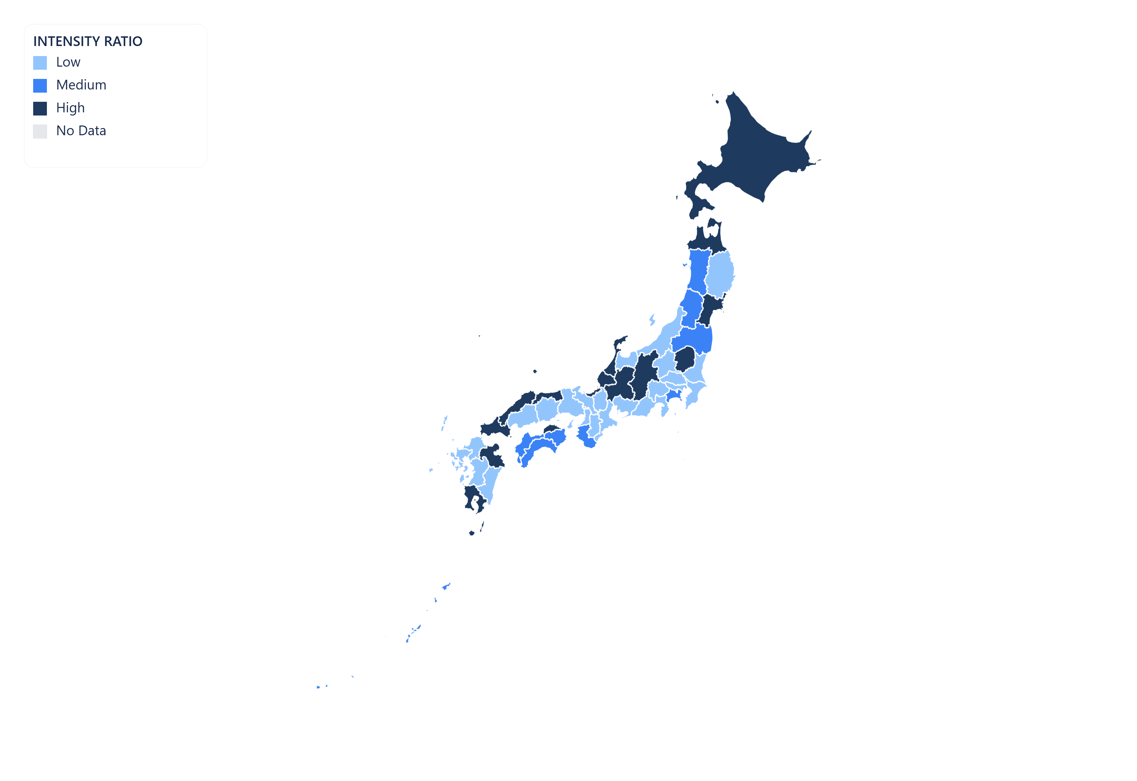
Vector SVG export
Export your Japan map as a scalable vector graphic (SVG). Ideal for print publications, editorial illustrations, and web use — scales to any resolution without quality loss.

Animated GIF
Bring your Japan data to life. Import historical time-series data and export a looping animated GIF showing how regional values changed over time.
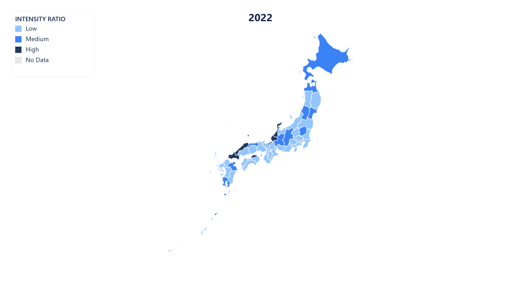
MP4 video export
Export your Japan time-series map as an MP4 video. Perfect for presentations, reports, and social media posts where motion communicates change more clearly than static images.
Public share page
Share your Japan choropleth map with a public link. Anyone with the URL can view the full interactive map — no account or login required.
Embeddable iframe
Embed your Japan choropleth map anywhere with a single line of HTML. The iframe stays live — viewers always see the latest version of your map, no re-publishing needed.
AI-powered data import for Japan maps
No spreadsheet? No problem. Regionify's AI Agent turns a plain-text description or raw pasted data into a ready-to-visualize dataset in seconds.
AI Generator
Generate Japan data from a prompt
Describe the dataset you need in plain English — for example "GDP per capita of Japan's 47 prefectures in 2023" or "election results by prefectures" — and the AI generates a plausible, structured dataset that maps directly onto Japan's administrative boundaries. Edit any values in the table view before saving.
- ✓ Works for population, GDP, health, election, and custom metrics
- ✓ Supports time-series prompts for animated maps
- ✓ Output pre-matched to Japan's 47 prefectures
AI Parser
Clean and import messy Japan data
Paste raw text, a copied Wikipedia table, or an unstructured CSV with regional figures for Japan. The AI parser normalises region names, strips noise, resolves mismatched spelling across Japan's prefectures, and outputs a clean id–label–value table ready to visualise.
- ✓ Handles inconsistent or misspelled prefectures names
- ✓ Auto-detects time columns for historical data
- ✓ Streams results in real time as AI processes
AI Agent is available on the Chronographer plan.
Prefectures of Japan
- Aichi
- Akita
- Aomori
- Chiba
- Ehime
- Fukui
- Fukuoka
- Fukushima
- Gifu
- Gunma
- Hyogo
- Hokkaido
- Hiroshima
- Ibaraki
- Ishikawa
- Iwate
- Kochi
- Kagawa
- Kumamoto
- Kanagawa
- Kagoshima
- Kyoto
- Mie
- Miyagi
- Miyazaki
- Niigata
- Nagano
- Nara
- Nagasaki
- Okinawa
- Osaka
- Okayama
- Oita
- Saga
- Shiga
- Shimane
- Saitama
- Shizuoka
- Tochigi
- Tokyo
- Tokushima
- Tottori
- Toyama
- Wakayama
- Yamaguchi
- Yamanashi
- Yamagata
Build your own Japan choropleth map — free
Upload any dataset, color Japan's prefectures by any numeric metric, and export as PNG, SVG, GIF, or MP4. No design skills required — start in seconds, publish anywhere.